Katharine Fengler - SHE SHED, Warhus Rittershaus

Installation view, Katharine Fengler, SHE SHED, Warhus Rittershaus

Installation view, Katharine Fengler, SHE SHED, Warhus Rittershaus

Installation view, Katharine Fengler, SHE SHED, Warhus Rittershaus

Installation view, Katharine Fengler, SHE SHED, Warhus Rittershaus

Installation view, Katharine Fengler, SHE SHED, Warhus Rittershaus

Installation view, Katharine Fengler, SHE SHED, Warhus Rittershaus

Installation view, Katharine Fengler, SHE SHED, Warhus Rittershaus

Installation view, Katharine Fengler, SHE SHED, Warhus Rittershaus

Installation view, Katharine Fengler, SHE SHED, Warhus Rittershaus

Installation view, Katharine Fengler, SHE SHED, Warhus Rittershaus

Installation view, Katharine Fengler, SHE SHED, Warhus Rittershaus

Installation view, Katharine Fengler, SHE SHED, Warhus Rittershaus

Katharina Fengler’s work mesmerizes in its dauntless use of color. It has a dazzling, absolute presence – a lure that is hard to withdraw from. As part of her large airbrushed works, foreground becomes background as colors fade into each other on the wrinkled, structured Tyvek that she employs. In these swaths of merging colors diverging elements surface – scribbles, brushstrokes, cut-out images – all equally hovering on a plane with no perspective. In their different materialities, these gestures range from awkward and dripping, to sly and shy, to forceful and assertive. Breaking open the purely abstract, the images included and the titles given make reference to contemporary culture – current forms of lifestyle connected to nutrition, make-up, or gender roles; the changing obsessions with the body induced by consumer culture.

[Melanie Bühler, freelance curator/researcher, Amsterdam, 2016]

SHE SHED is Katharina Fengler’s first solo show as solo artist in Germany. She presents new large-scale paintings on Tyvek as well as mixed media salt dough objects. The title of the show is a neologism referring to little garden houses designed especially by and for women as counterparts to the slightly more popular 'man cave' or 'mantuary'. Without any aspiration of wanting to depict ’she sheds', Fengler adopts the term metaphorically to challenge the expectations that are (still) bound to assigned work, gender and lifestyle norms. 

Katharine Fengler - SHE SHED,
Wahres Rittershaus, June 4 - July 15
www.warhusrittershaus.com

Contribution by Domenico de Chirico. 

Johana Pošová & Barbora Fastrová - Brother, Syntax

One of the central subjects in the collaborative practice of Prague based artists Johana Pošová and Barbora Fastrová is the field of Nature and its antagonistic relation with the concepts of Western modernity. Nature in Western modernity has been traditionally conceptualised as an obstacle that is to be overcome or utilised by human needs, determining thus the stance of the Modern human as the anthropocentric other, whose wants and interests are given preferential treatment. Nature therefore, became subjugated to the purpose and the operation of scientifically equipped humanity, making Western man the master and the possessor of Nature. The objectification of such understanding transformed Nature into a subject detached from man; Nature became a separate space, a threat and something that is to be overcome and exploited.

Drawing from a myth of the Kogi indigenous group – a tale of two brothers, whose distinct approach and treatment of nature in many ways mirrors the Western and the Non-Western approach to the natural, Johana Pošová and Barbora Fastrová present through their exhibition a place where these relations are questioned and renegotiated, and the superiority of the Western man is rendered other. Rather than applying a strict rationalism, which has repeatedly failed and served only as a means to unveil the limits of modernity and the inability to control (the destructive) interactions between society and Nature, the exhibition employs a language of the absurd and the non-rational. Making use of the archetypal nature of selected objects and the obvious artificiality of these objects, the exhibition tries to point to the complexity of the biotic community and to our failure in understanding and trying to manipulate Nature similarly to the younger brother of the Kogi myth. 

Text by Markéta Stará Condeixa.

Johana Pošová & Barbora Fastrová - Brother
Syntax, May 26 - July 9
www.syntaxproject.org

NEIL RAITT - LANDSCAPETUAL, MON CHÉRI

Installation view, Neil Raitt, Landscapetual, Mon Chéri

Installation view, Neil Raitt, Landscapetual, Mon Chéri

Installation view, Neil Raitt, Landscapetual, Mon Chéri

Installation view, Neil Raitt, Landscapetual, Mon Chéri

Installation view, Neil Raitt, Landscapetual, Mon Chéri

Installation view, Neil Raitt, Landscapetual, Mon Chéri

Installation view, Neil Raitt, Landscapetual, Mon Chéri

Installation view, Neil Raitt, Landscapetual, Mon Chéri

Installation view, Neil Raitt, Landscapetual, Mon Chéri

Installation view, Neil Raitt, Landscapetual, Mon Chéri

Installation view, Neil Raitt, Landscapetual, Mon Chéri

Installation view, Neil Raitt, Landscapetual, Mon Chéri

Simba was thrust into the limelight in 2013, He now lives and works in London. Simba was so scared, so scared man, but he grew into himself when that strange dust settled, the dust that rearranged everything.

Sheets and sheets in the waste :
Aldi’s well that ends well
Aldi’s good in da hood
Aldi’s fair in love and canvas

A cactus is a member of the plant family Cactaceae within the order Caryophyllales. The word «cactus» derives, through Latin, from the Ancient Greek ƩнƩƲƮư kaktos, a name originally used by Theophrastus for a spiny plant whose identity is not certain. And its a symbol of a mothers unconditional love in other cultures innit for its medicinal qualities.

A song for any season. Sat on the roof, kicked off the Bob Ross, see a few of the cabins they had got me quite cross. Anyway, the thing is what I really mean Is that Joshua Sex was Born in Ireland, having graduated from the Royal College of Art in 2013. He now lives and works in London.

Brendan Giles was born in Sevilla, Spain. Having graduated from the Royal College of Art in 2011, he now lives and works in London.

Tim Zercie was born in the USA. Having graduated from the Royal College of Art in 2013 he now lives and works in London.

Vista had a sister, never knew how much he missed her. She now Lives and works in London.

Persistent Belief

Text by Charlie C C Audsely.

Neil Raitt - Landscapetual
Mon Chéri, June 9 - July 16
www.moncheri.co

Contribution by Domenico de Chirico.

MARGO WOLOWIEC - Summer Learning Loss, Laura Bartlett Gallery

Installation view, Summer Learning Loss, Laura Bartlett Gallery

Installation view, Summer Learning Loss, Laura Bartlett Gallery

Installation view, Summer Learning Loss, Laura Bartlett Gallery

Installation view, Summer Learning Loss, Laura Bartlett Gallery

Installation view, Summer Learning Loss, Laura Bartlett Gallery

Installation view, Summer Learning Loss, Laura Bartlett Gallery

Installation view, Summer Learning Loss, Laura Bartlett Gallery

Installation view, Summer Learning Loss, Laura Bartlett Gallery

Installation view, Summer Learning Loss, Laura Bartlett Gallery

Installation view, Summer Learning Loss, Laura Bartlett Gallery

Installation view, Summer Learning Loss, Laura Bartlett Gallery

Installation view, Summer Learning Loss, Laura Bartlett Gallery

The exhibition takes its title ‘Summer Learning Loss’ from research into the effects of extended leisure time within educational contexts, noting that on average one month of learning is lost during a student’s summer vacation. There is a hidden cost to relaxation: information loss, we are warned. This anxiety is played out in this body of weavings, in which digital images of popular vacation locations are cropped from their context and layered until faceless – familiar, but no longer real or ideal. The personal becomes anonymous, the private now shared, the author disappears into the background.

These hot spots are sourced using automated algorithms set up to identify popular geotags and hashtags online. Desktop folders archive the trends, creating a catalogue of mountains, sunsets, forests and seascapes, from which the artist filters and chooses. Wolowiec uses a sublimation dye process to transfer these images onto polyester threads which warp and distort under the heat – abstracting the images further – and loosely weaves these threads together by hand, according to the binary logic of the loom: up/down, on/off – transforming jpegs into textiles, pixels into knots. At once ethereal and concrete, the works emphasise a capacity unique to weaving, to shift between traditions, shuttle between theoretical positions and hover around borders. These works are in-tension and ex-tension; nomadic in essence, they voyage in place. The delight is in the detail – the haptic vibration of yarns juxtaposed. The resultant tapestries are cinematic, yet static – tied down by threads, the material gives form to the data. The ideal is made anodyne through a muddling of colours: woodland on water, on sunset, on sand. Screenshots, stitched together, swiping fast and slow.

Though quick to capture, the speed and neurosis of the imagery is offset by the process of handweaving, which acts as a slow, considered counter-gesture of sorts; meditative in its resistance to time, it allows the artist, to decelerate, process and delay the object’s manufacture and consumption.

A distressed, striated aesthetic remains; disrupted only by diagonal gestures in ink – a scribble or cross to the surface that joins the panels and calls to mind edits on a photographic contact sheet – a punctum, to pull the personal back in. Indeed, Wolowiec’s work can be viewed with 19th Century American photographic traditions in mind, but so too, with the desire to capture the landscape reminiscent of 18th Century landscape painters and the New York Hudson River School.

Her anxious rich abstractions work with technology – old and new – to capture the seen/unseen white noise of a web-ready world. This sonic quality is echoed in her video works, which play on repeat like computer screensavers, aiming to capture the landscape, with a shaking hand – all 360 degrees. Displayed on free-standing acrylic screens, opposite, and at right-angles to the weavings, the imagery floats from one axis of the artist’s body – reversing the movement of the loom: down/up – creating a diaristic, almost painterly map of the landscape, from shore and shrubs to sky. 

Margo Wolowiec - Summer Learning Loss
Laura Bartlett Gallery, June 10 - July 31
www.laurabartlettgallery.com

TIMOTHY HULL - FOR AMMONIS, WHO DIED AT 29, IN 610, ASHES/ASHES

Installation view, For Ammonis, Who Died at 29, in 610, ASHES/ASHES

Installation view, For Ammonis, Who Died at 29, in 610, ASHES/ASHES

Installation view, For Ammonis, Who Died at 29, in 610, ASHES/ASHES

Installation view, For Ammonis, Who Died at 29, in 610, ASHES/ASHES

Installation view, For Ammonis, Who Died at 29, in 610, ASHES/ASHES

Installation view, For Ammonis, Who Died at 29, in 610, ASHES/ASHES

Installation view, For Ammonis, Who Died at 29, in 610, ASHES/ASHES

Installation view, For Ammonis, Who Died at 29, in 610, ASHES/ASHES

Installation view, For Ammonis, Who Died at 29, in 610, ASHES/ASHES

Installation view, For Ammonis, Who Died at 29, in 610, ASHES/ASHES

Installation view, For Ammonis, Who Died at 29, in 610, ASHES/ASHES

Installation view, For Ammonis, Who Died at 29, in 610, ASHES/ASHES

Installation view, For Ammonis, Who Died at 29, in 610, ASHES/ASHES

Installation view, For Ammonis, Who Died at 29, in 610, ASHES/ASHES

Installation view, For Ammonis, Who Died at 29, in 610, ASHES/ASHES

Installation view, For Ammonis, Who Died at 29, in 610, ASHES/ASHES

Installation view, For Ammonis, Who Died at 29, in 610, ASHES/ASHES

Installation view, For Ammonis, Who Died at 29, in 610, ASHES/ASHES

Referencing the poetry of CP Cavafy, this new series of work further articulates the complex territory of language, memory, history and sexuality at play within Hull’s idiomatic painting. With richly steeped allusions to the ancient world and the Greek language, CP Cavafy’s poetry merged Classical and homoerotic themes, often referencing his home city of Alexandria and its confluence of Latin, Greek, Coptic and Arabic languages and culture. His 1917 poem “For Ammonis, Who Died at 29, in 610” is composed as an epitaph mourning not only the death of a beloved young poet but also Alexandria’s broader shift away from Greek language and culture in the 7th century.

Mining Cavafy’s elegiac prose and the context of inconsolable loss, Hull’s newest paintings incorporate an imperfect retelling of a continuity of past events, untethered to one specific moment or point. This imperfect tense, as applied through Hull’s painting, is a form where the incidence of linguistic, iconographic pastiche and raw sentimentality cohabitate beyond the constraints of time and place: ancient ruin and contemporary obsolescence become indistinguishable.

Erotic and poetic narratives are wrought through Hull’s richly textured and sprawling surfaces patterned with iconographic Greek, Coptic and early Arabic glyphs and imagery laid out in painterly washes, splashes and splatters. Recurrent motifs of Attic vases and silhouettes of the erotic figures of Kourous and Endymion are featured in a series of portraits. In another series, a stacking of painted tablets address the obfuscation of linguistic memory over time. In his intense layering and geometric abstraction, the density of Hull’s composition is formally loaded with the sensibilities of abstract art rubbing against a camp imagining of a Classical past.

As semiotic and pictorial amphorae, each of Timothy Hull’s paintings carry the tension between an imperfect past and anachronistic present, becoming dialectical spaces that are as equally befitting to ancient Alexandria as they would be to contemporary visual identity.

Timothy Hull (born 1979, New York, NY) received an MFA at Parsons School of Design, New York, and a BA at New York University, New York. Recent solo exhibitions include: Painting in the Imperfect Tense, Klaus von Nichtssagend Gallery, New York (2016) and Pastiche Cicero, Fitzroy Gallery, New York (2014). His work has been included in group exhibitions at Mitchell-Innes and Nash, The Hole, FRAC Lorraine, Tate Modern, the Morris Museum of Art, and the Nomas Foundation. His work has been featured and reviewed in the New York Times, Artforum, Art in America, Flash Art, Interview Magazine, the Los Angeles Times, and the San Francisco Chronicle.

Timothy Hull - For Ammonis, Who Died at 29, in 610
ASHES/ASHES, May 14 - June 25
www.ashesonashes.com

Contribution by Domenico de Chirico.

NORA BERMAN - CHARM, ELLIS KING

Installation view, Nora Berman, Charm, Ellis King

Installation view, Nora Berman, Charm, Ellis King

Installation view, Nora Berman, Charm, Ellis King

Installation view, Nora Berman, Charm, Ellis King

Installation view, Nora Berman, Charm, Ellis King

Installation view, Nora Berman, Charm, Ellis King

Installation view, Nora Berman, Charm, Ellis King

Installation view, Nora Berman, Charm, Ellis King

Installation view, Nora Berman, Charm, Ellis King

Installation view, Nora Berman, Charm, Ellis King

Installation view, Nora Berman, Charm, Ellis King

Installation view, Nora Berman, Charm, Ellis King

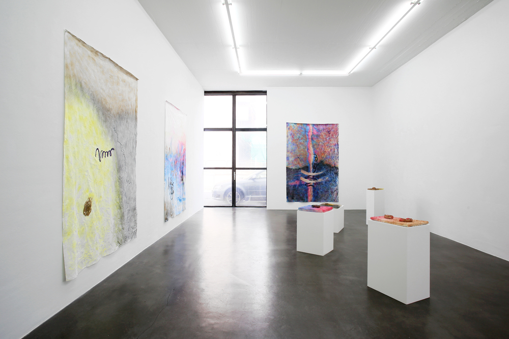
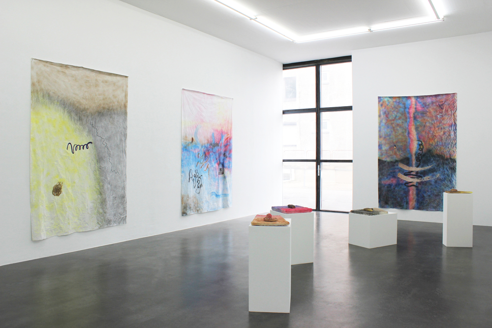
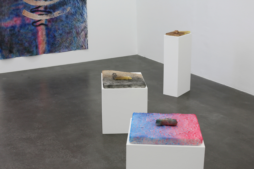
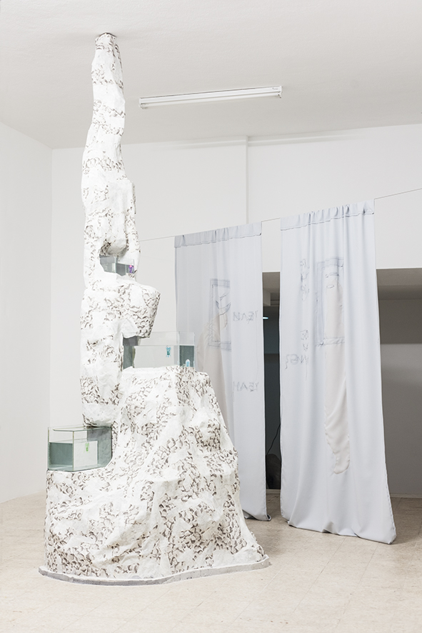
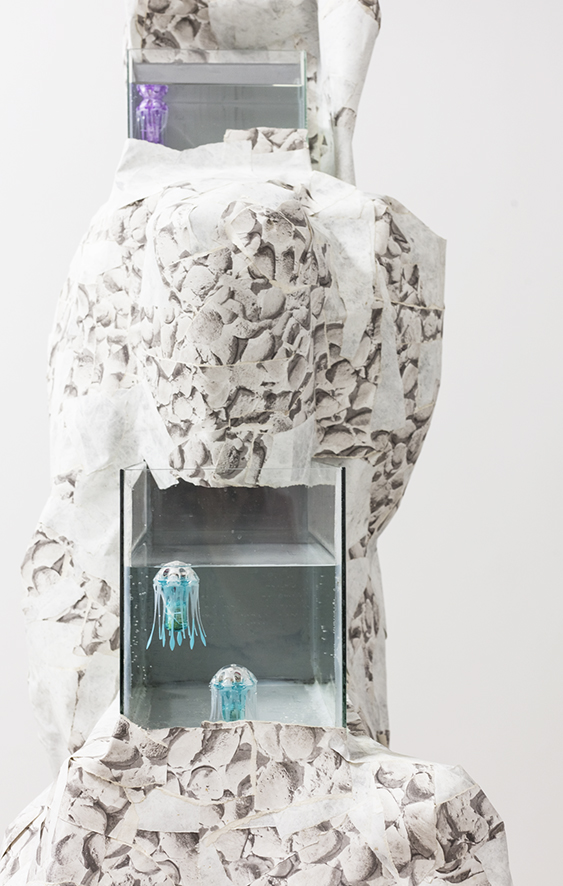
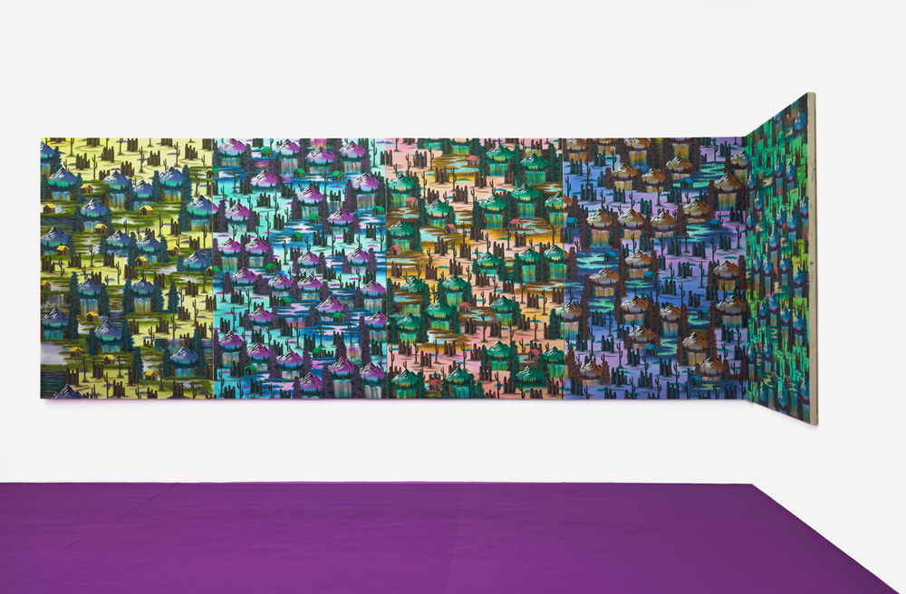
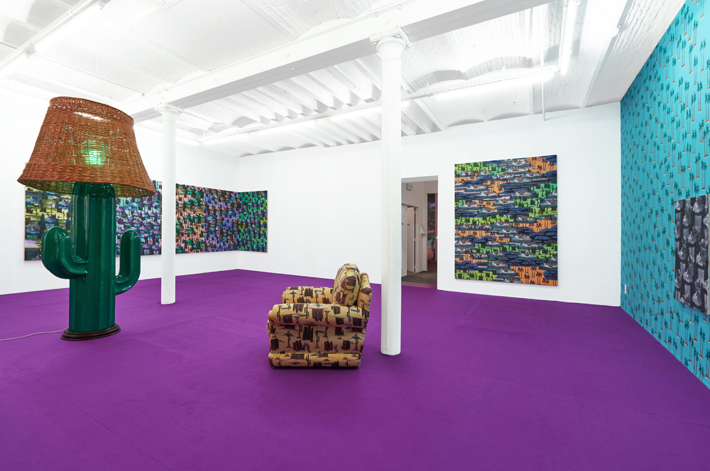
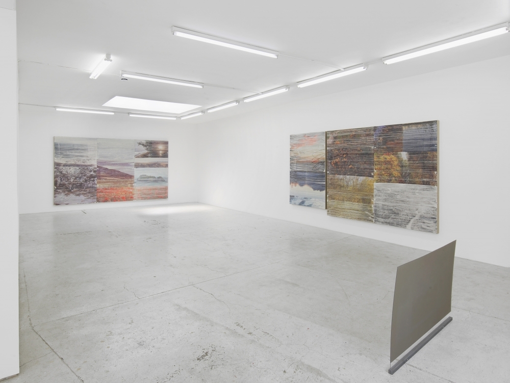
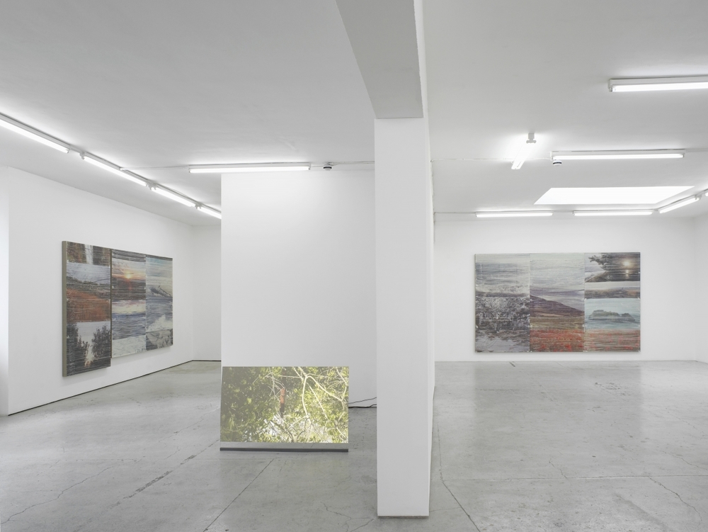
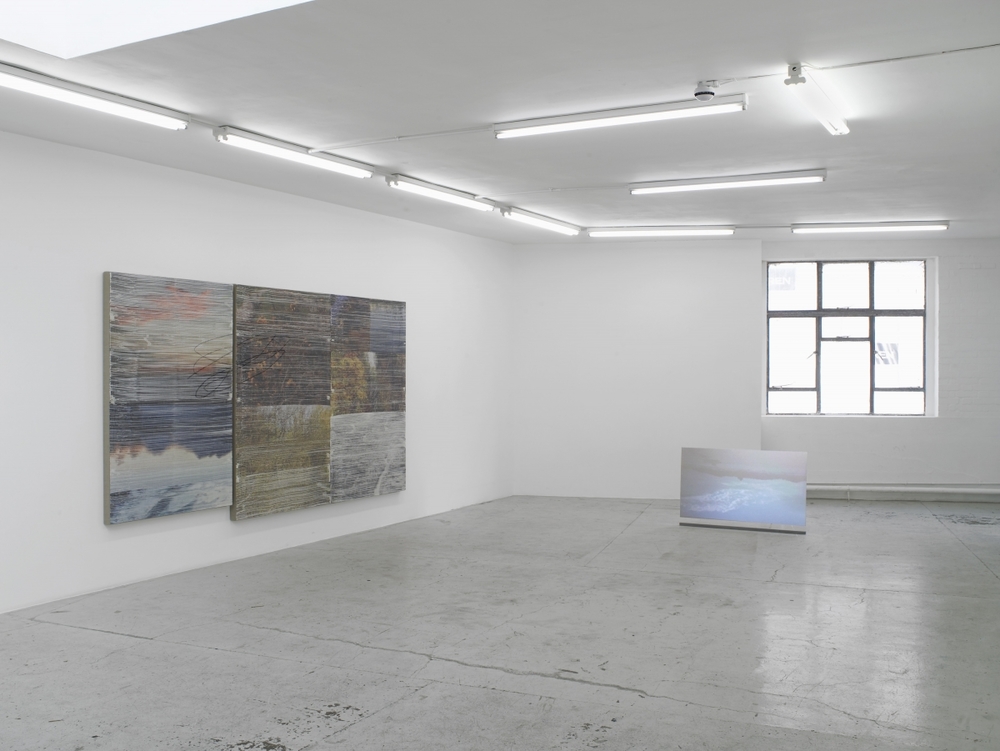
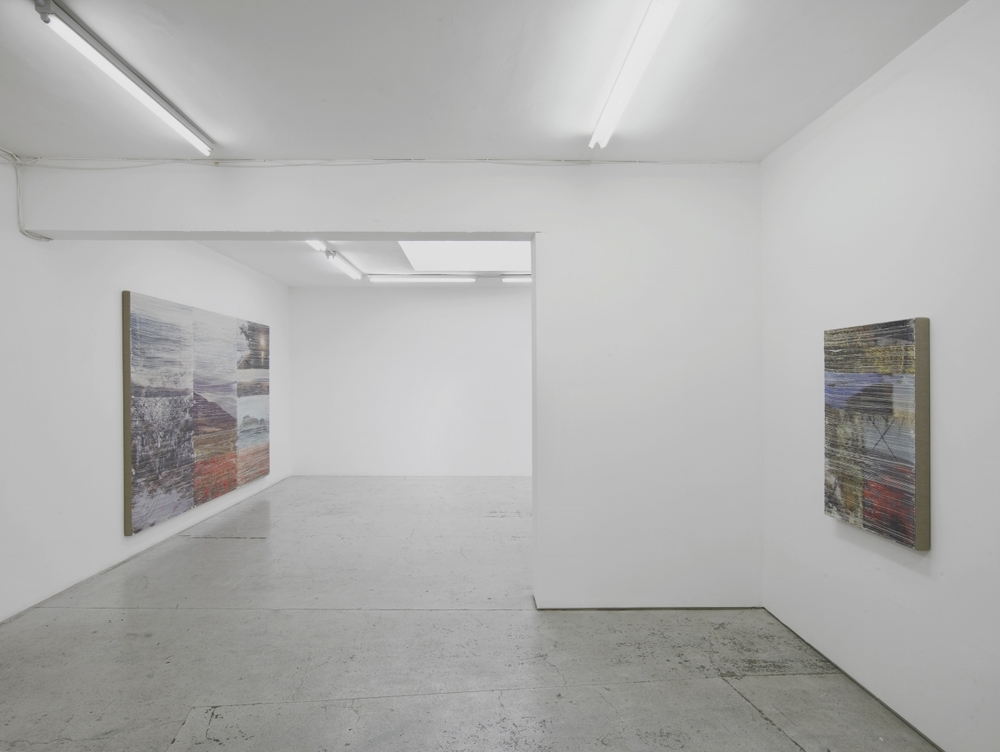
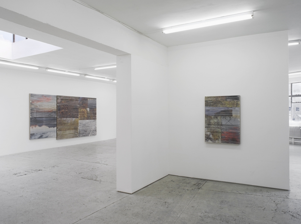
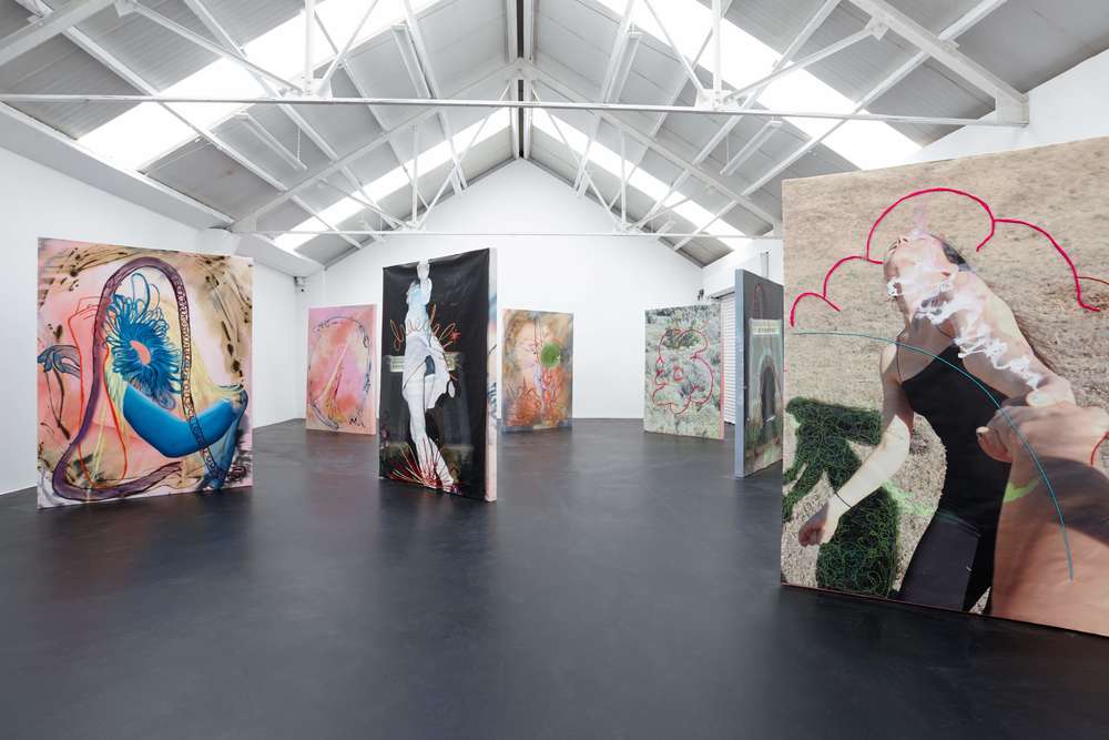
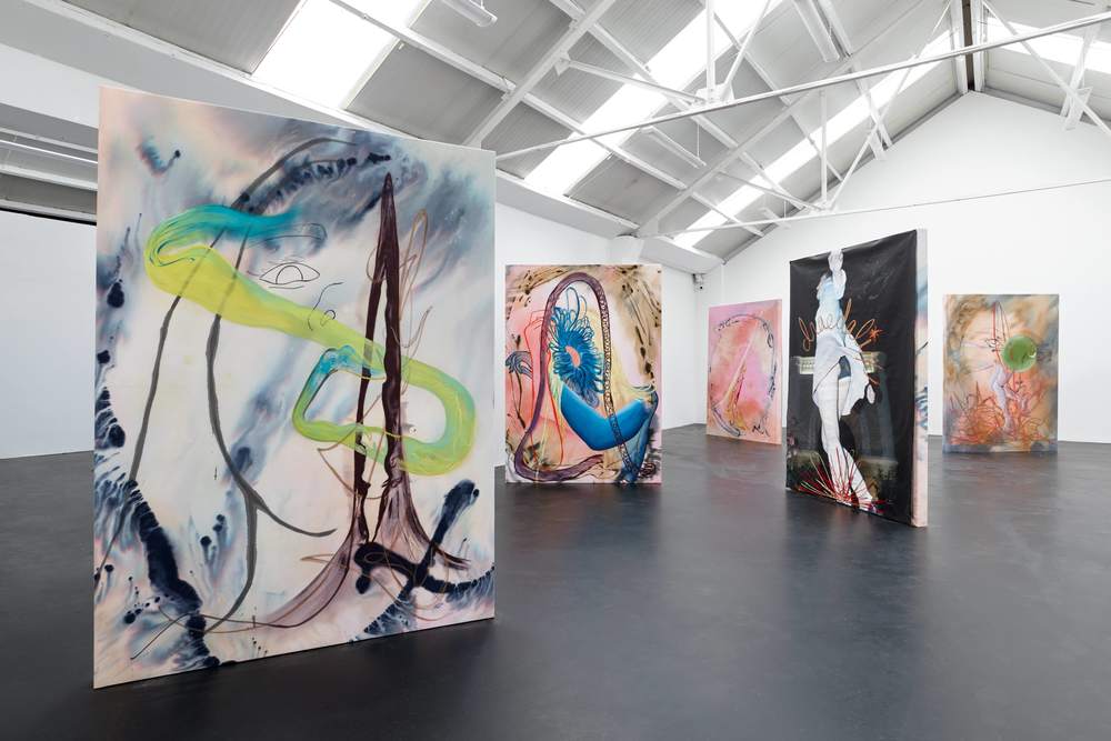
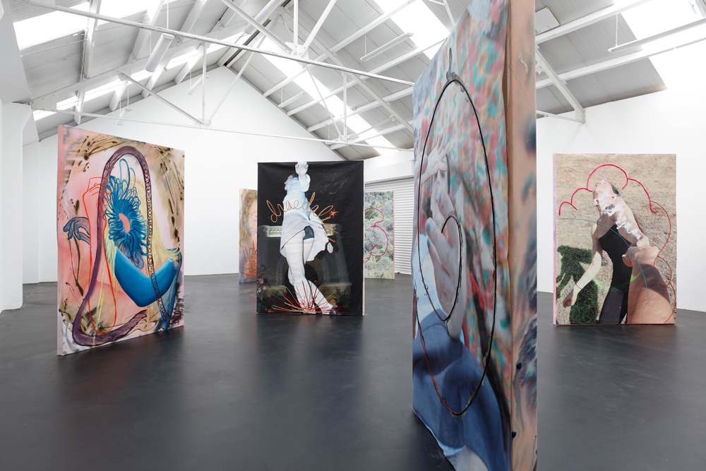
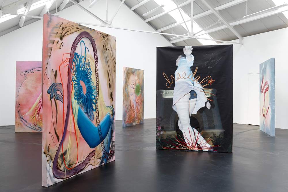
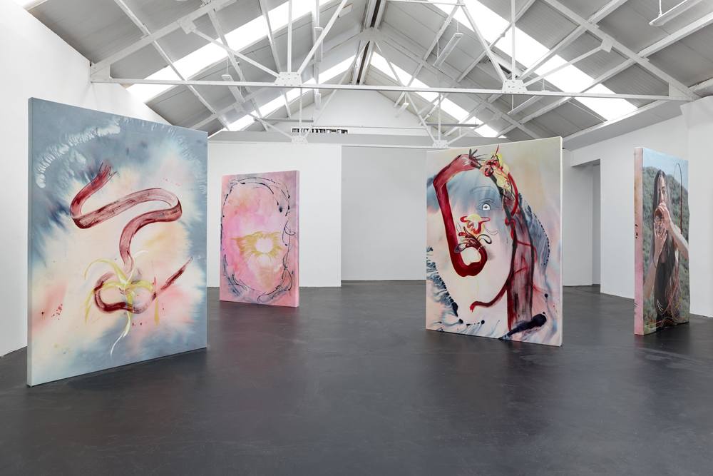
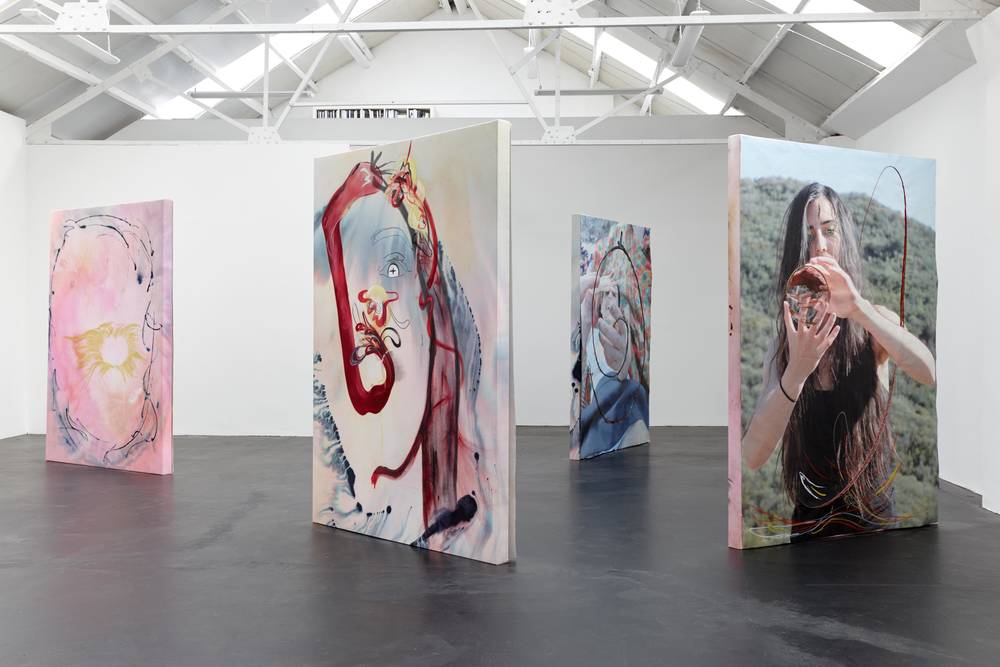
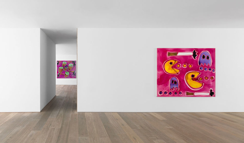
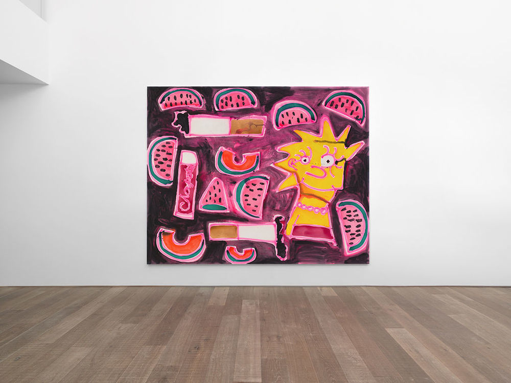
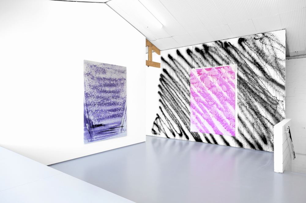
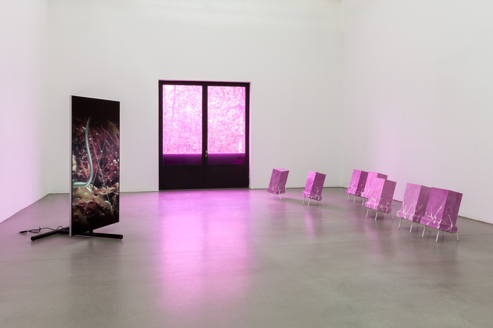
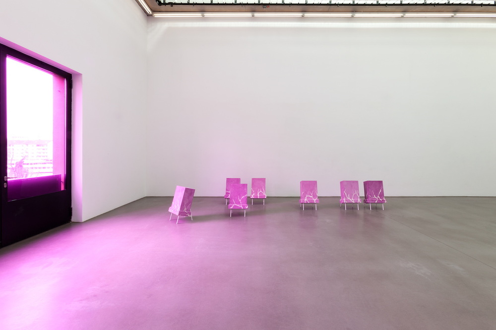
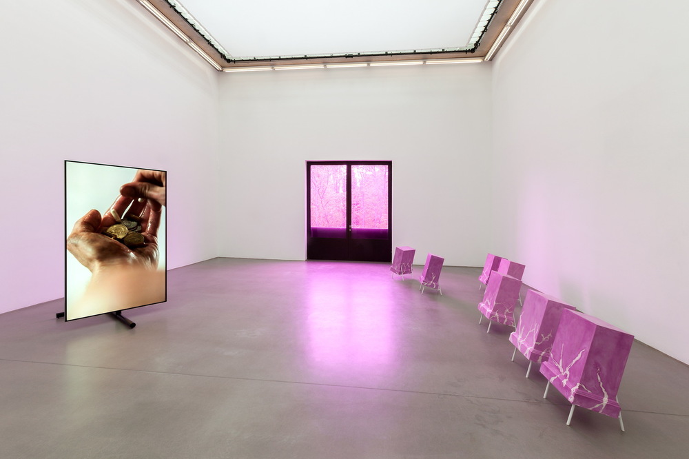
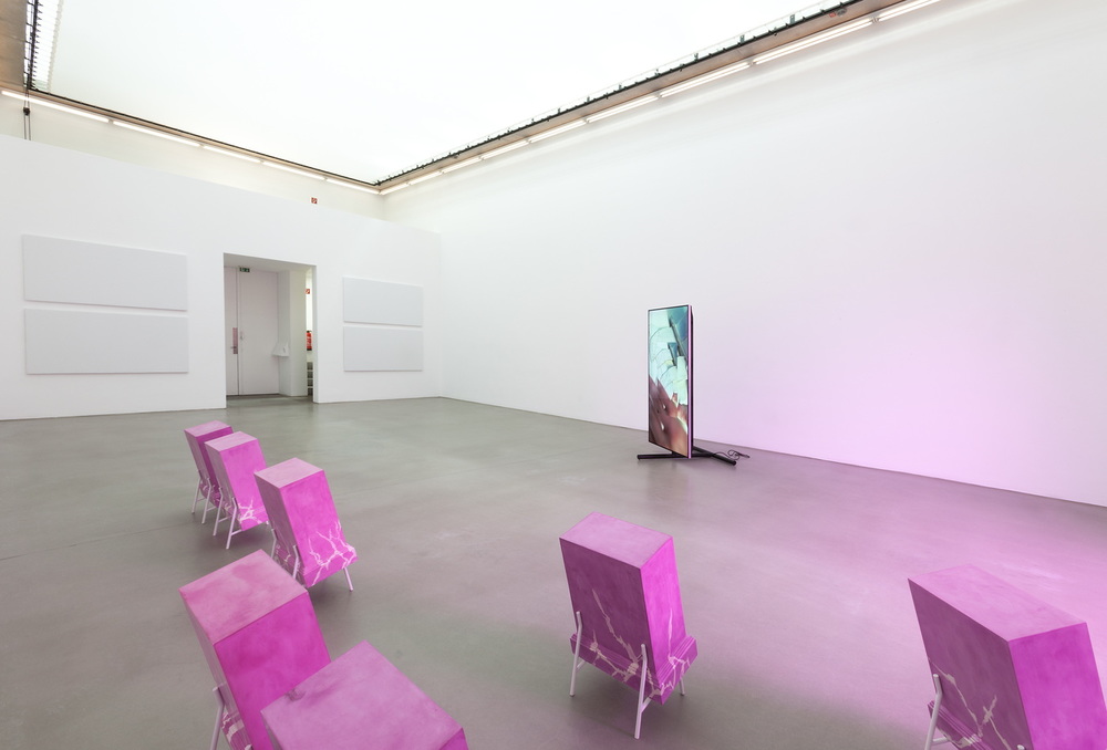
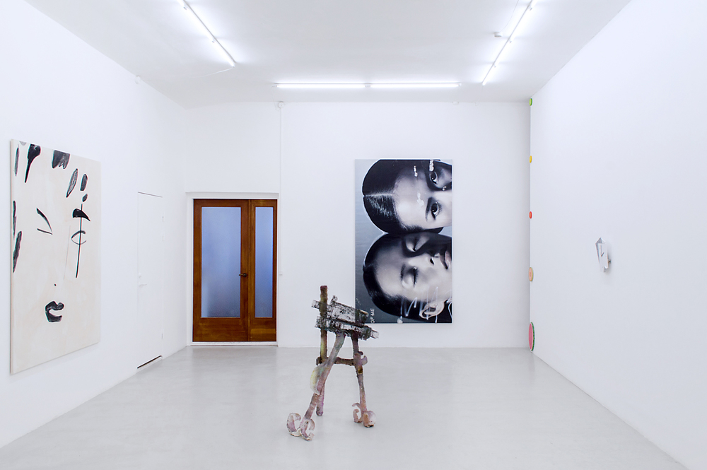
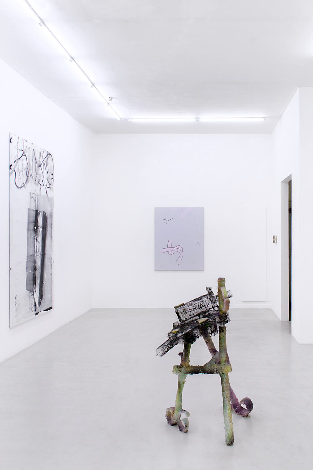
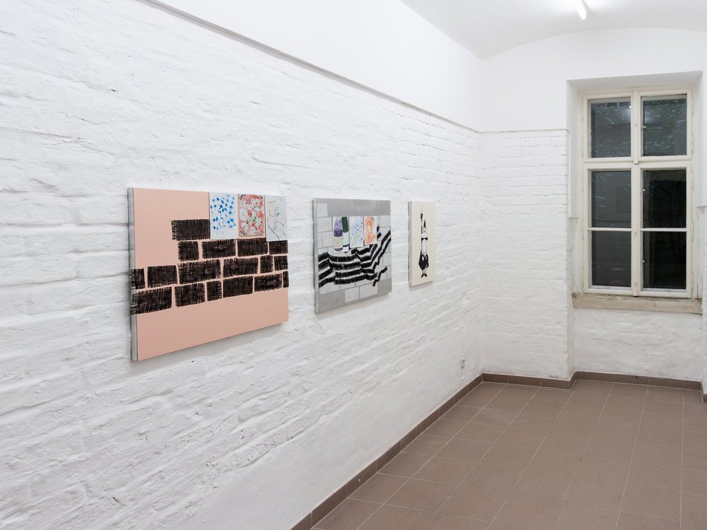
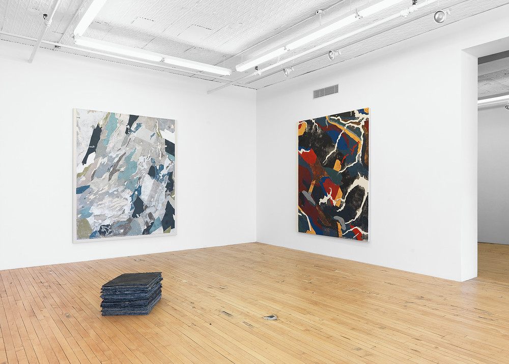
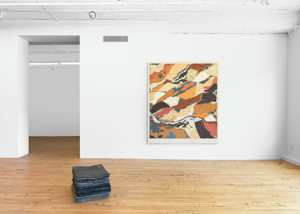
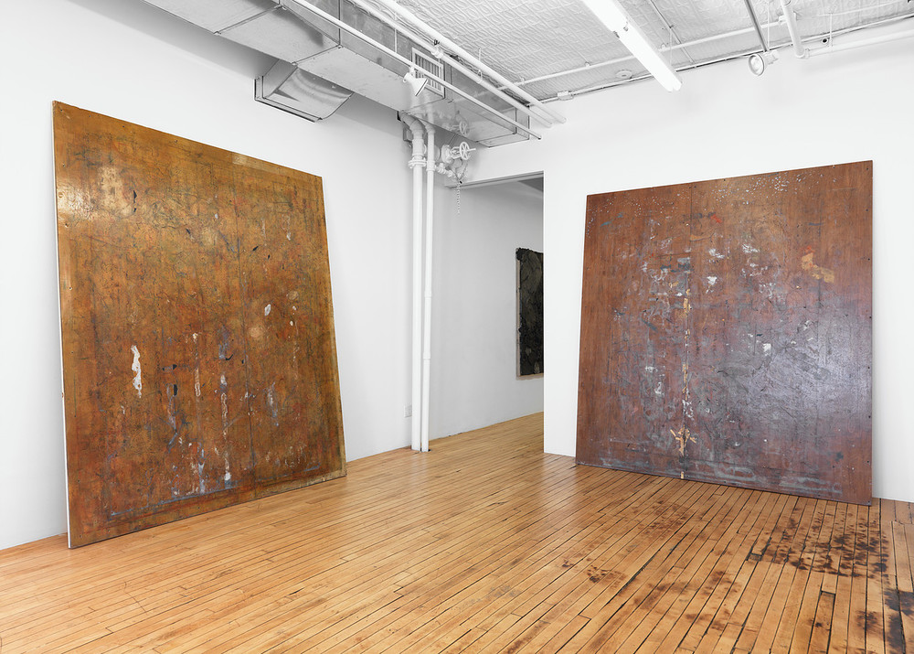
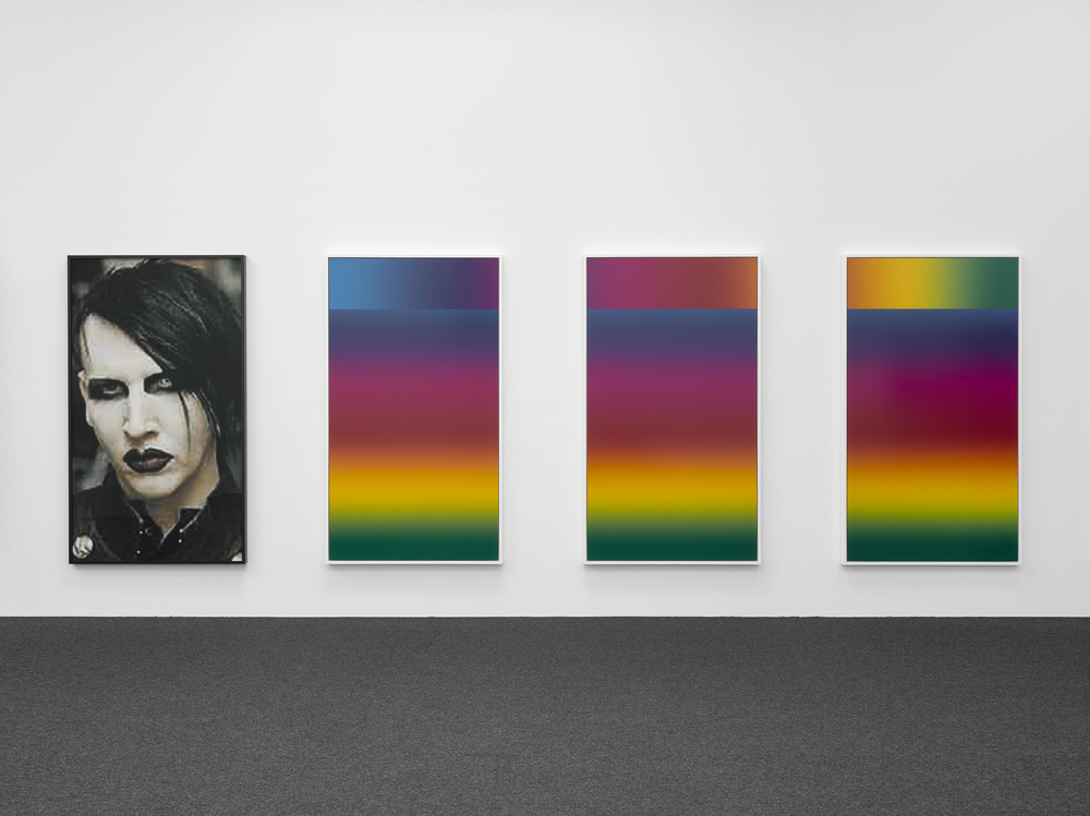
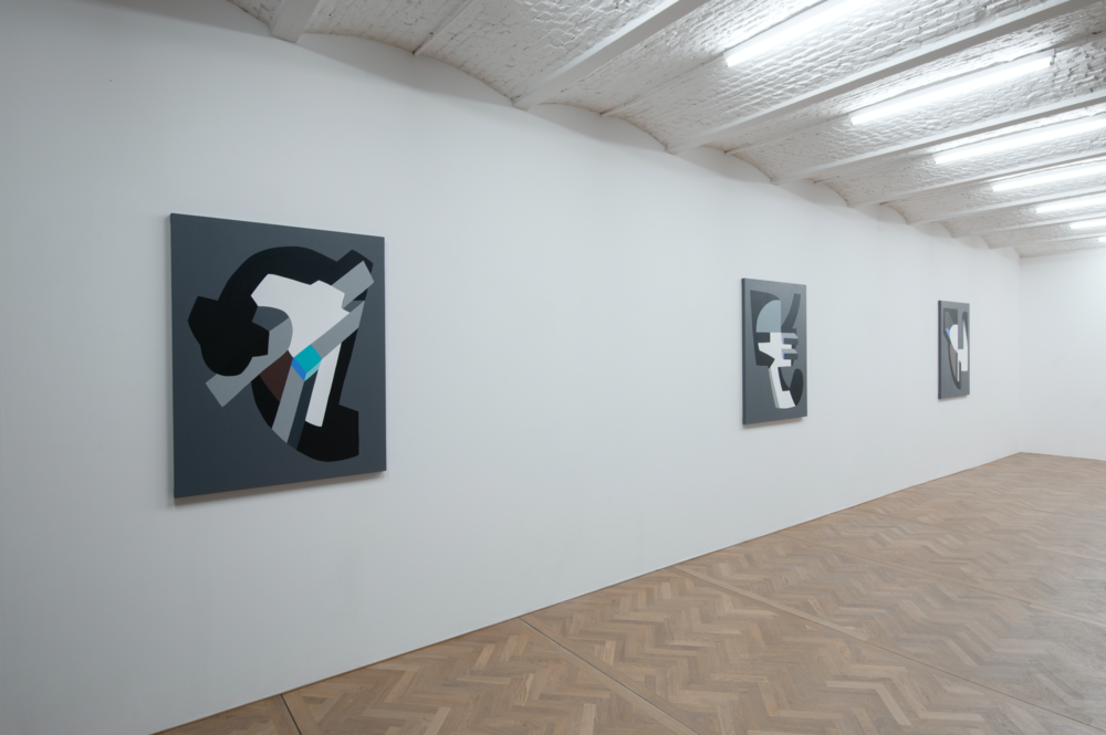
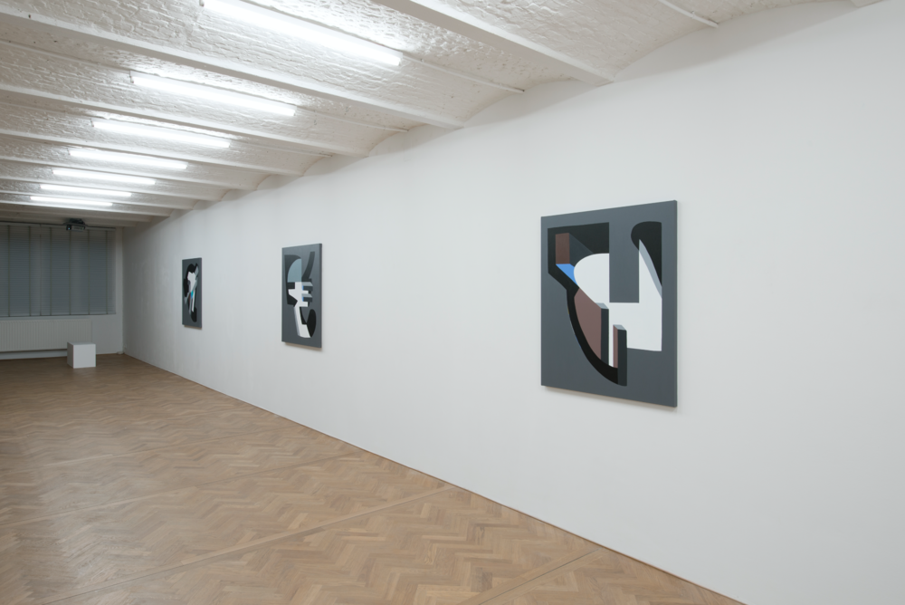
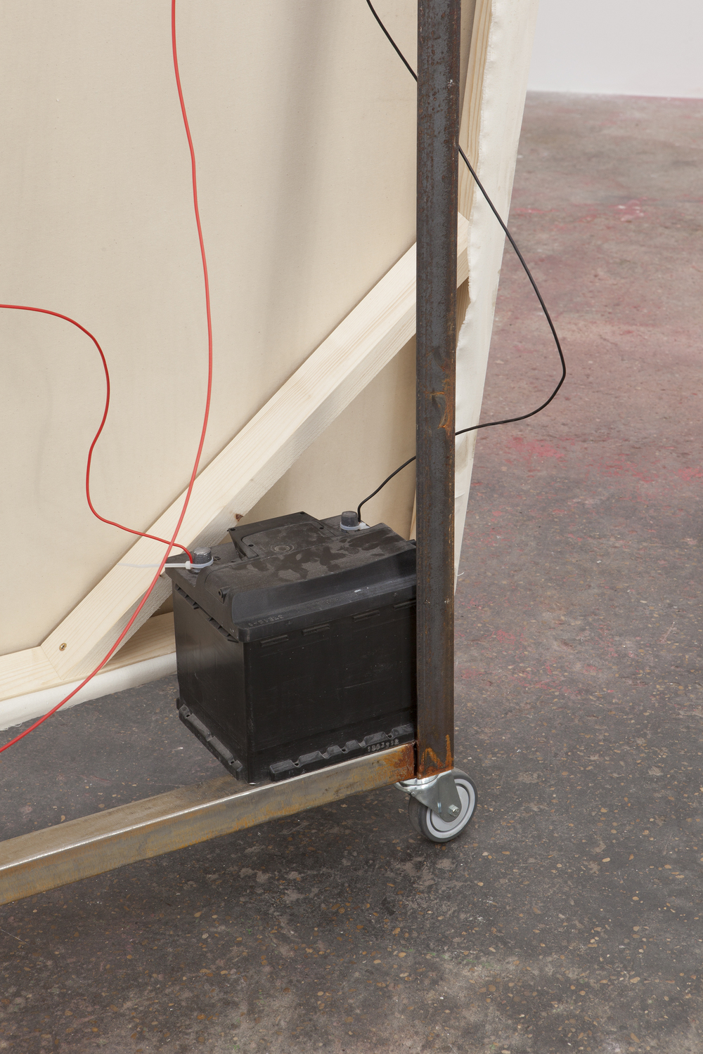
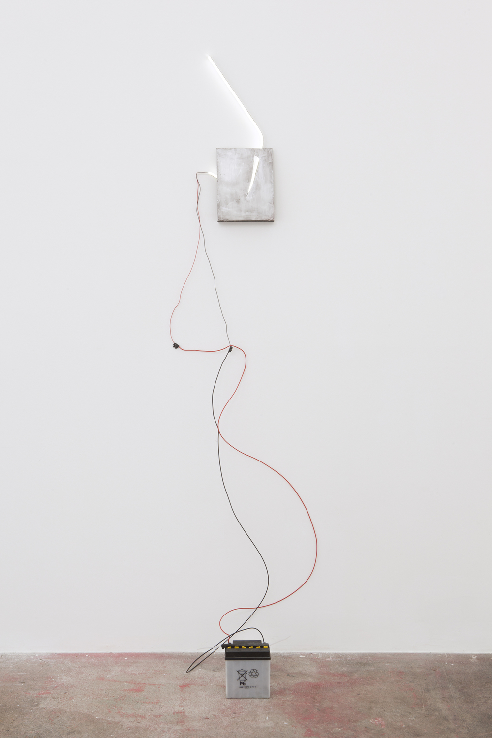
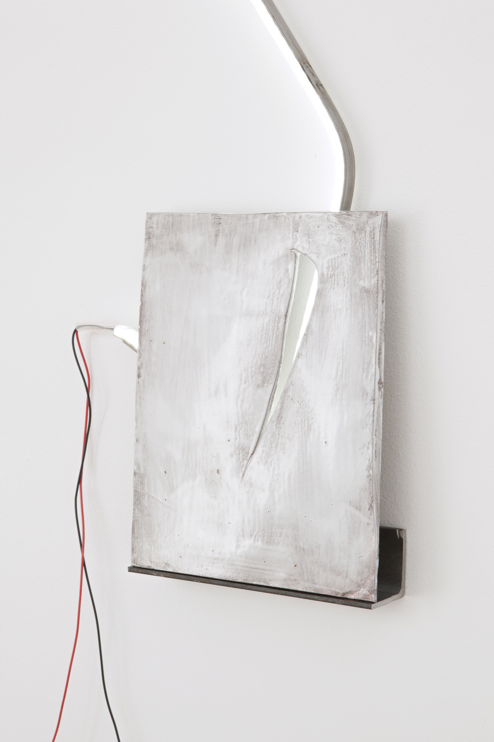
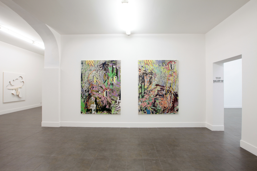
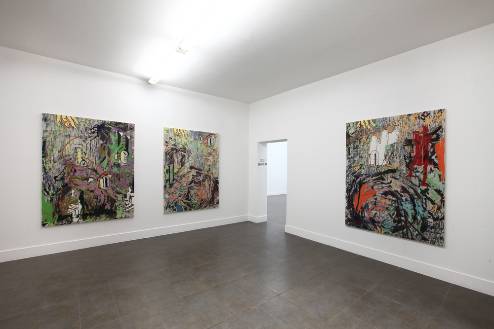
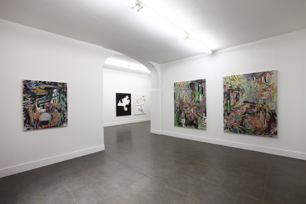
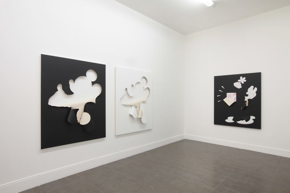
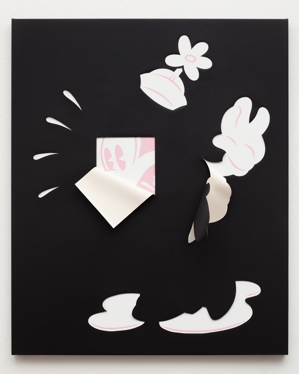
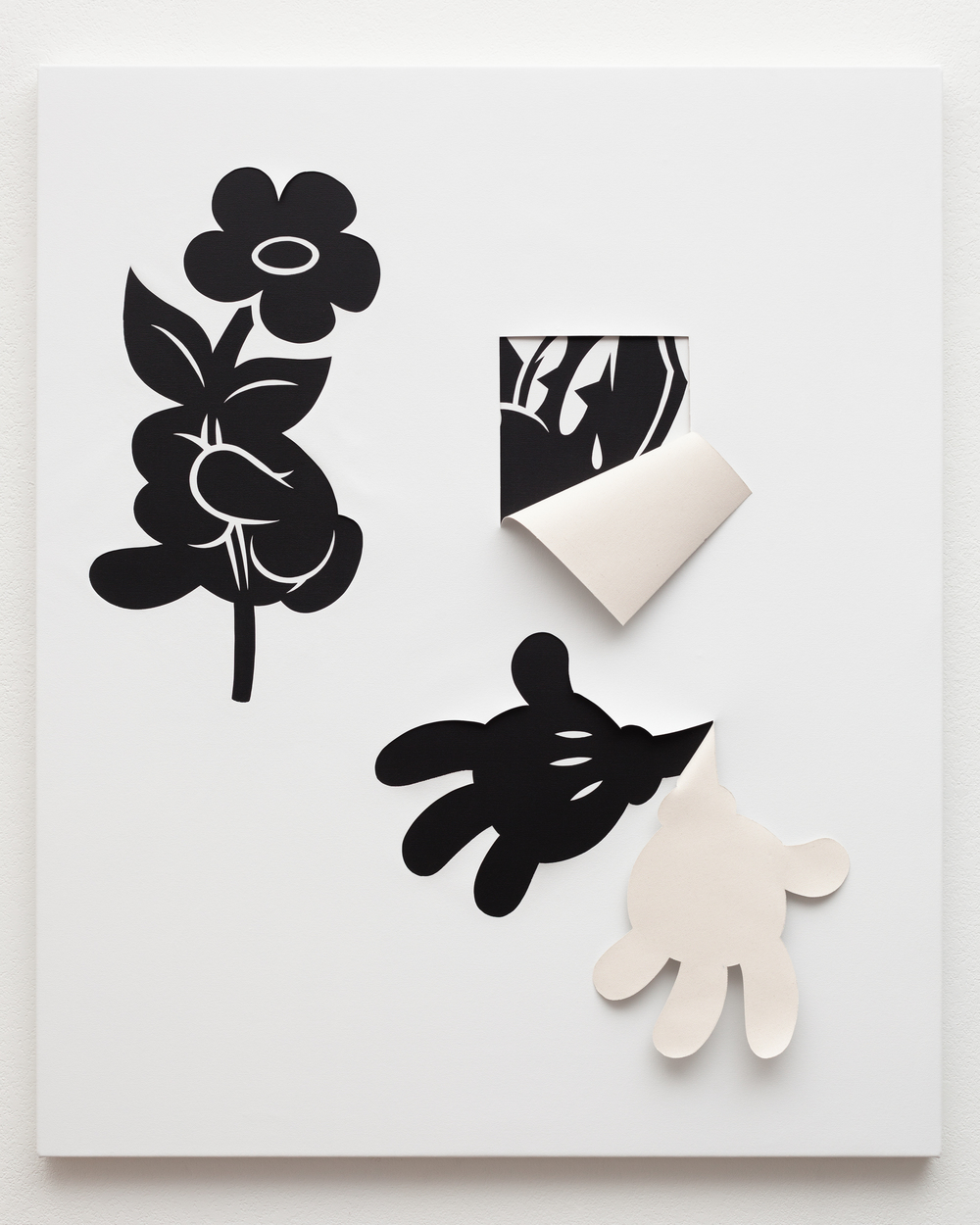
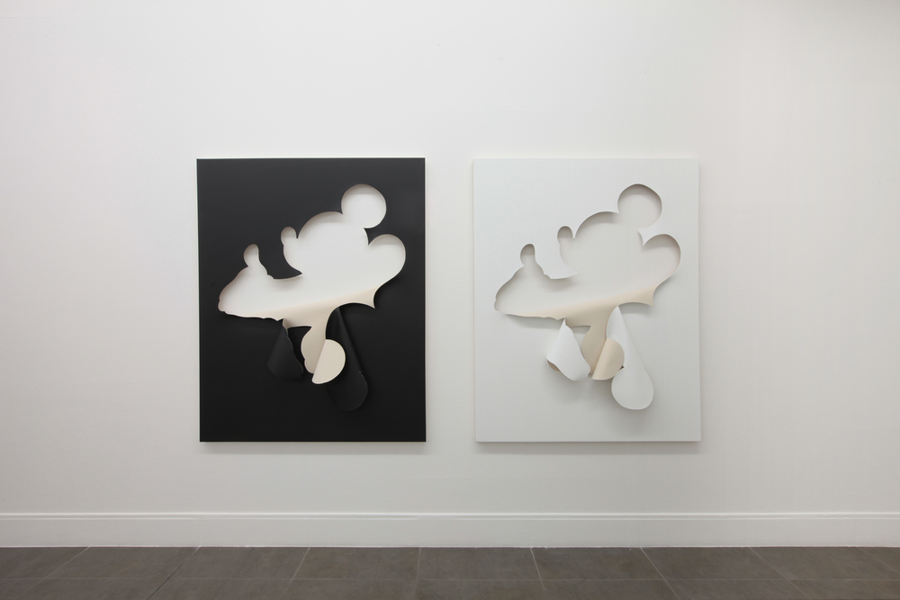
Ellis King is pleased to present the solo debut of Los Angeles-based artist Nora Berman’s Charm, an exhibition of eight, outsize, two-sided painting objects that toy with the perverse power of fascination. Each object’s life as a charm, so to speak, originates from Berman’s lived experiences as creator and subject of their opposing facades. Each work has a distinct front and back, and composed in the haphazard constellation of this show, they eschew their directionality and play off of one another as yin and yang—embellished photographs of the artist, and opposite, expressive figurations beamed out via her mind, eye, and hand.

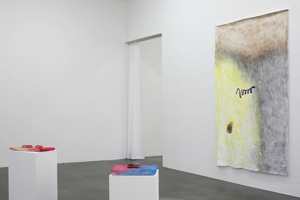
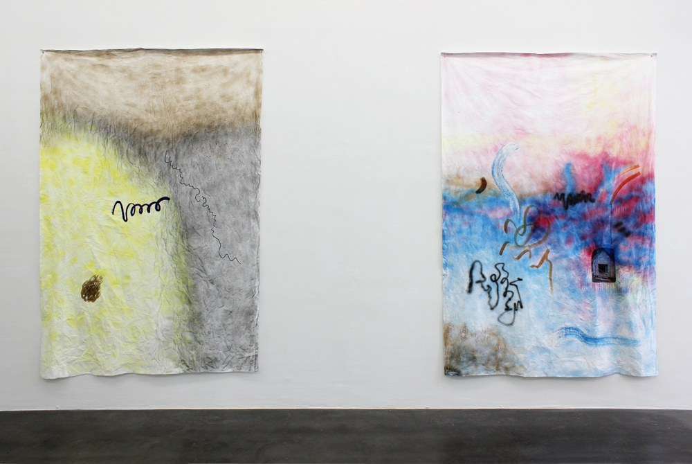
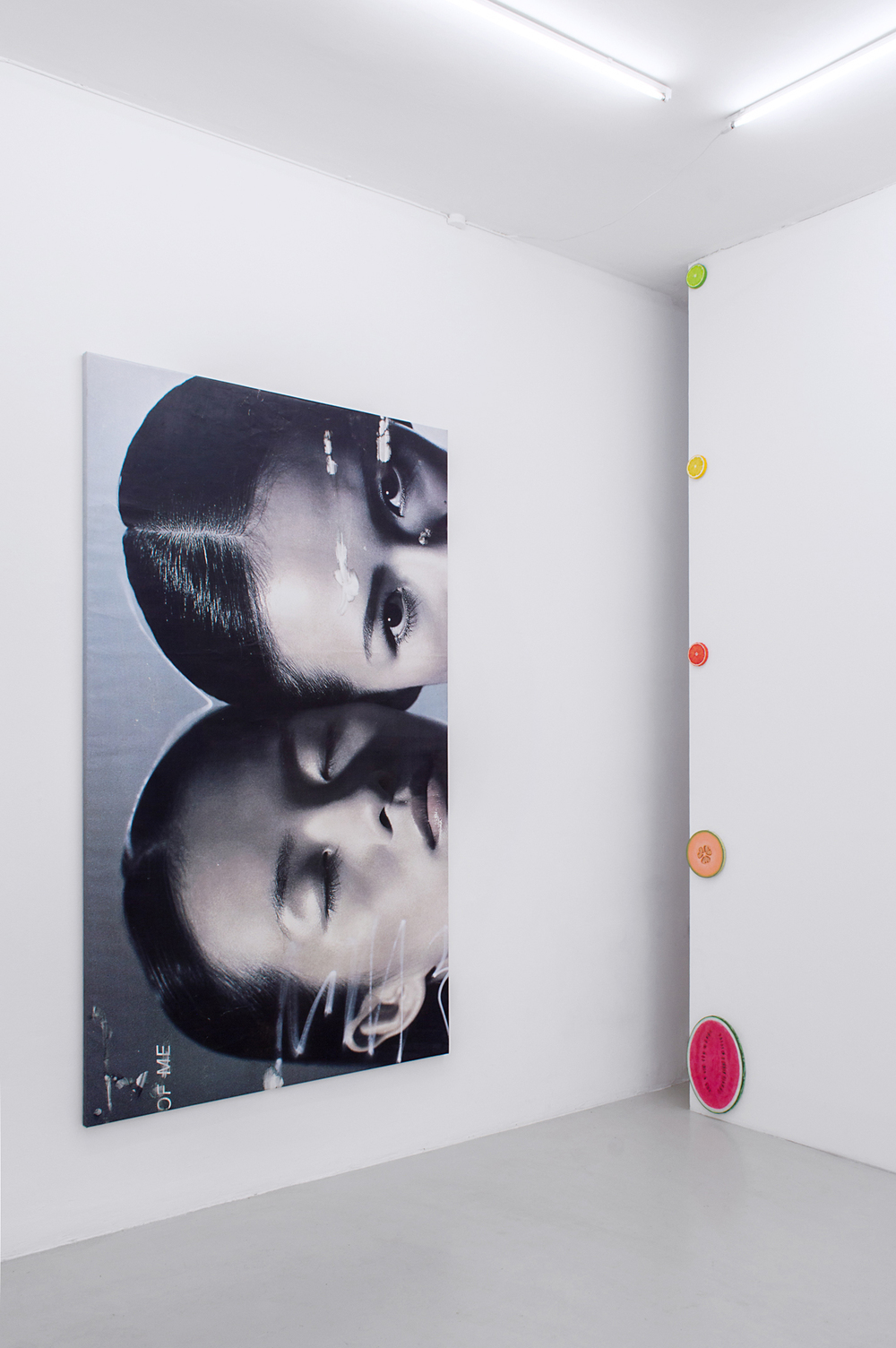
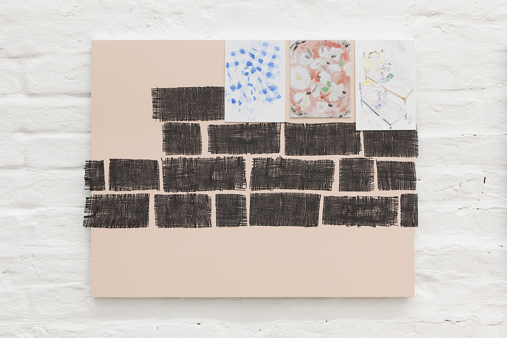
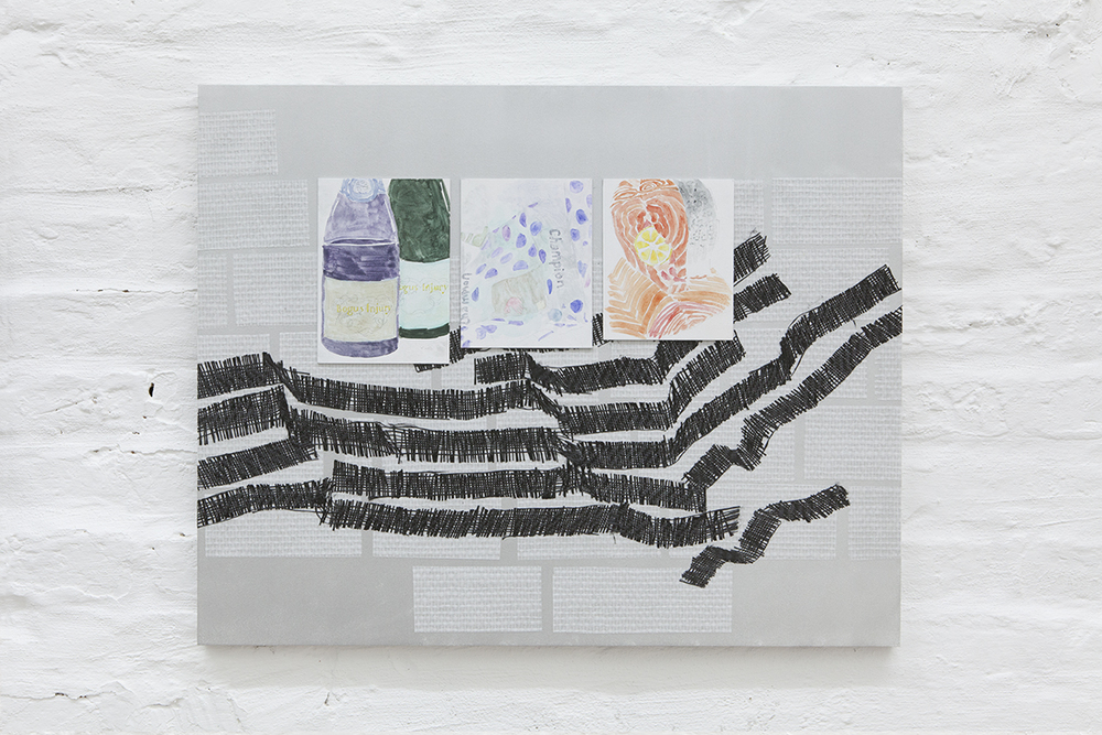
Photos of the artist mounted on stretchers form the foundation of one side. The snapshots were taken in and around her studio in Alhambra, California, a mix of suburbs and light industrial strips in the San Gabriel Valley, east of Downtown Los Angeles. The icon of the small city is a multi-story stucco arch built in 2010 as an homage to its namesake palace in the south of Spain. The arch, illuminated against a night sky and foregrounded by brushy botanicals, serves as a sort of establishing shot for photographic story that unfolds. It reappears in another image pointed up the artist’s skirt as her flash-blanched body twirls with abandon. Often spinning, in other pieces Berman offers images of herself abstracted or occluded, often by her own hand—a motif throughout the suite that toys with the polarity of push and pull between viewer and artwork, alternately inviting in and holding out.

The stylised candor of these shots, recall a documentary-style fashion editorial, which is intentional. Amateur photos of young artists have recently inspired a superficial, kneejerk rhetoric around ‘selfies’, which is not altogether accurate in this case. Berman has enlisted someone else to shoot her, rather exploitatively, as she poses—taking inspiration from a Japanese porn star whom privileges earnestness and personal style over graphic sexuality. (While previous works by Berman have doubled as sets for performances, the other vestiges of such that could be read into these works are these documented performances for camera). As if she were selling Lacoste in one shot, or chipped nail polish in another, there is an implicitly merchandised quality to the images that frustrated the power dynamics of what otherwise might appear to be a young woman objectified in her underwear. Rather than trying to promote the sale of herself through sexualized imagery, Berman casts herself as a vaguely employed model, taking sexy pictures to sell other commodities. Among them are more ineffable ones like romance, tourism, and youth culture, all tying back into the notion physicalized charms as mementos of being.

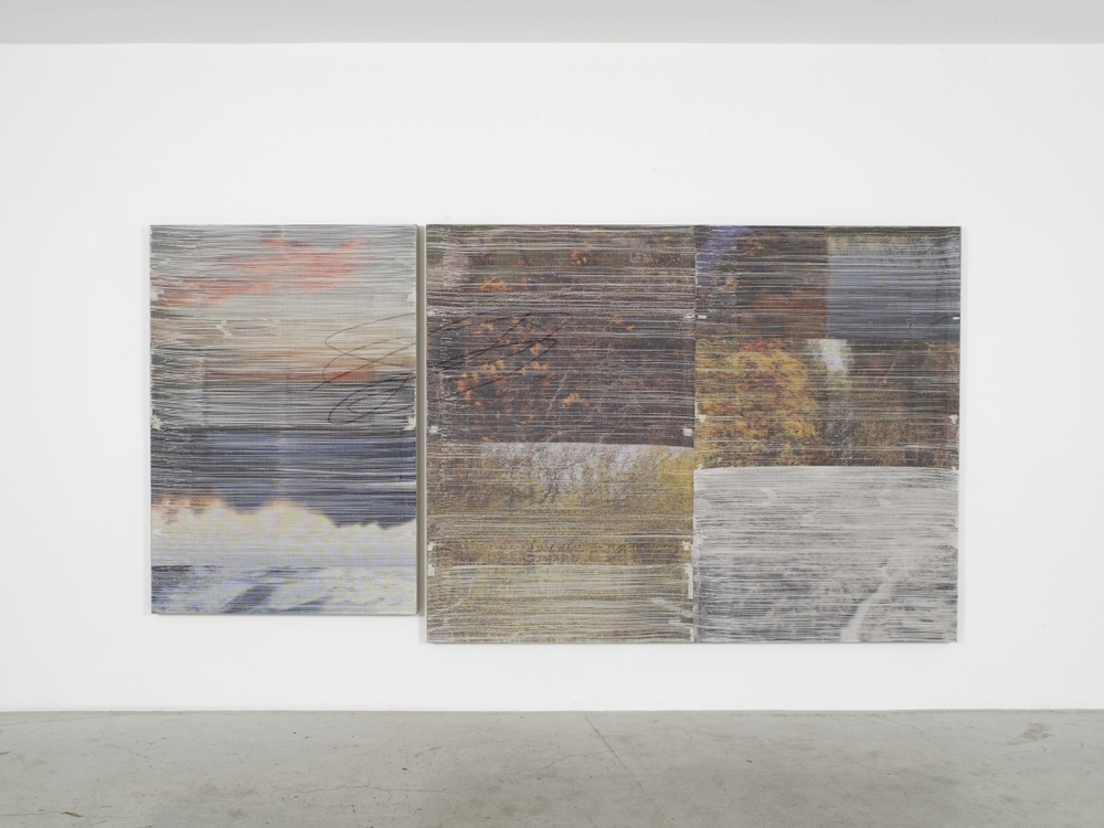
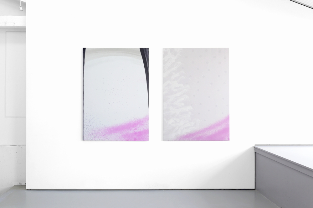
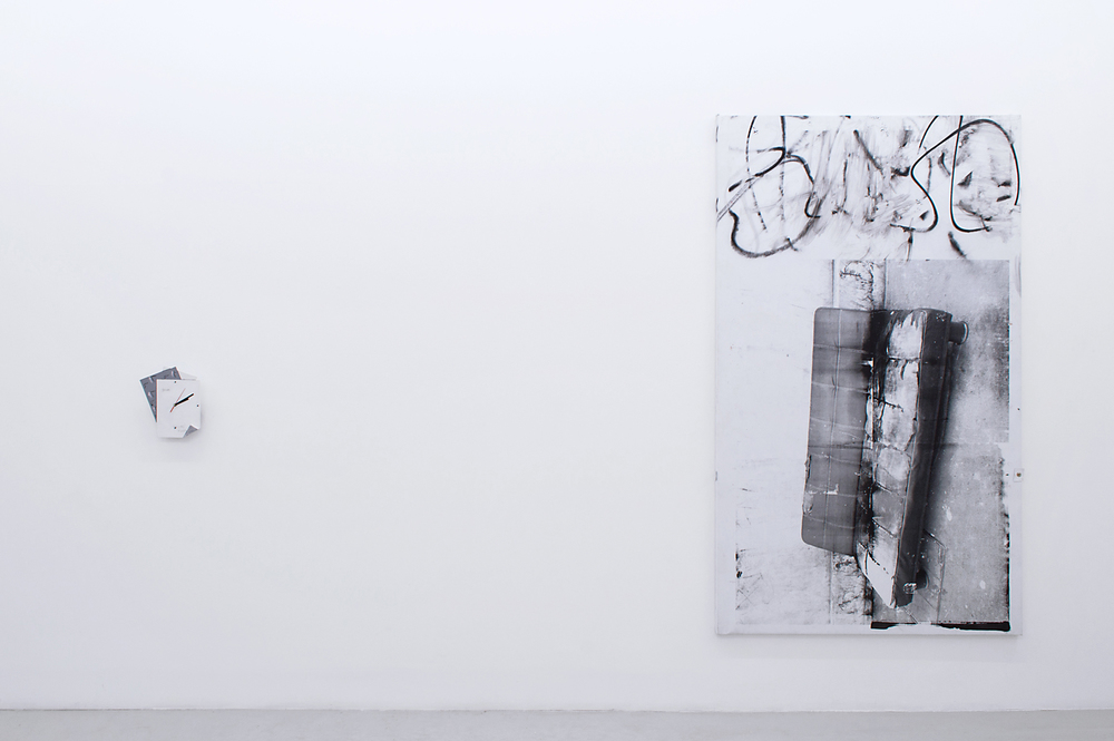
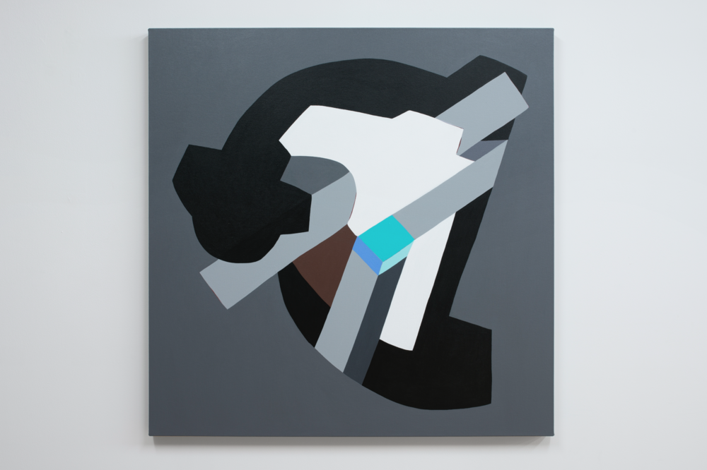
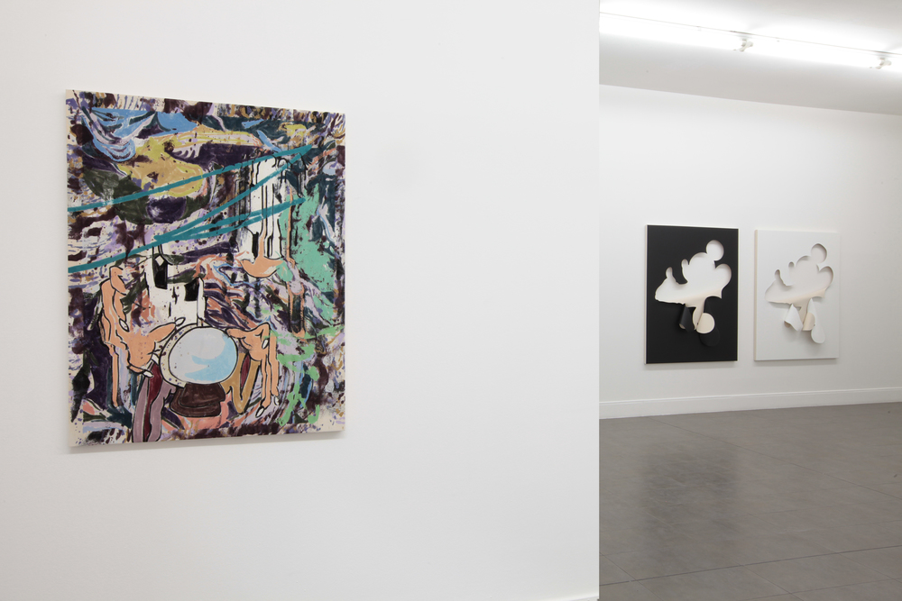
Berman has adorned and degraded these canvas prints with hand-drawn interventions; streaked oil stick, sprayed bleach, and stitched of yarn sewed into their facades. Most strikingly, on some the sewing spells out neologisms like DRAEDALIX (on the Alhambra arch up-skirt image) and KLYNX (written small, upon an outstretched finger as the image of the artist tumbles backwards into a Persian rug and overlaid bleach spiral). These made up words hover somewhere between onomatopoeia and instinctive meaning, invoking something like a Jewish dominatrix in the former, and breathing phonetic life into the spirit of fun in the latter. Berman relates these language games to the notion of jouissance, of the potent enjoyment that comes from free and at times disorienting, destabilizing play. Reading can be projected onto the art works on multiple registers, verbal and non-verbal, and in that reading the viewer can lose themselves as easily in an individual work as in the menagerie of panels.

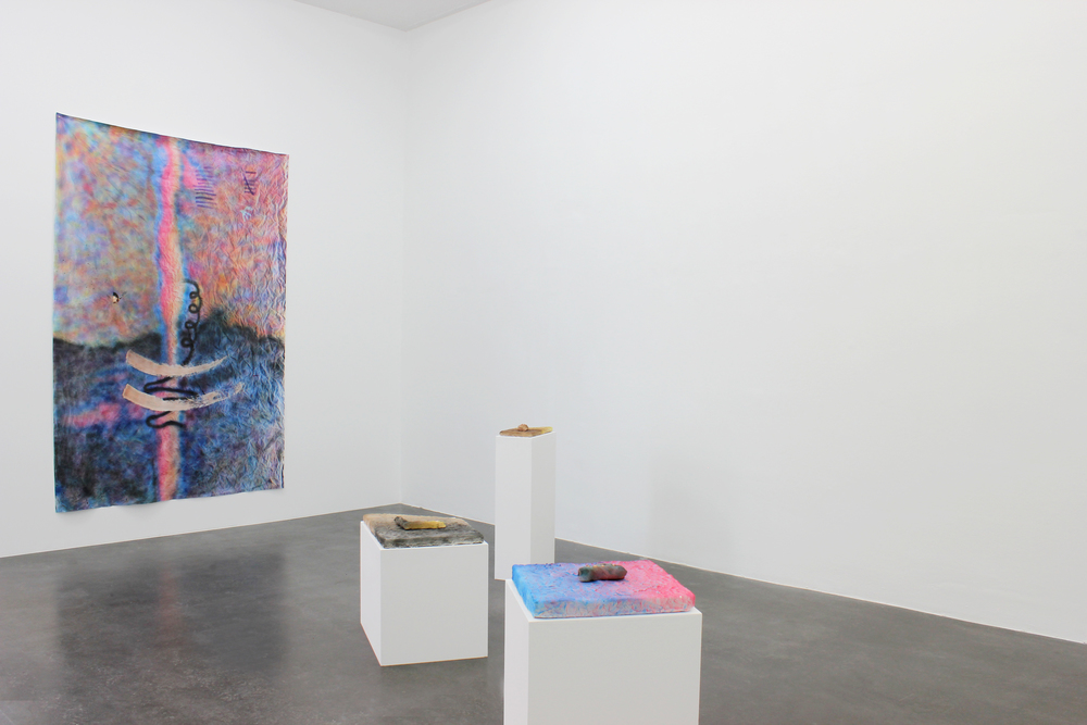
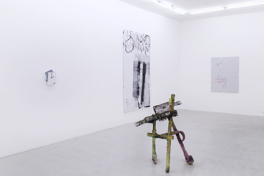
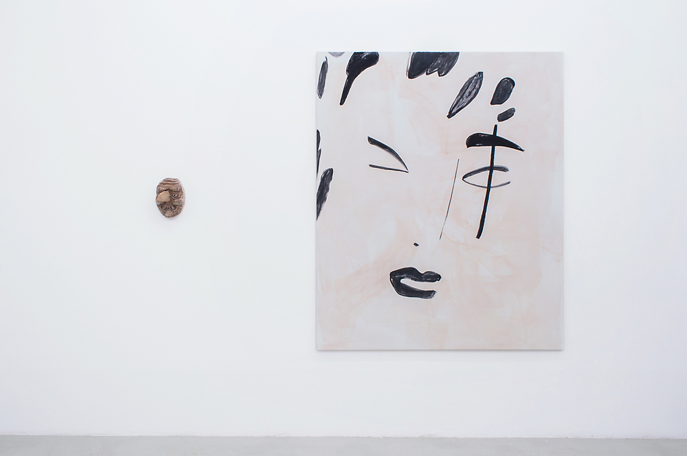
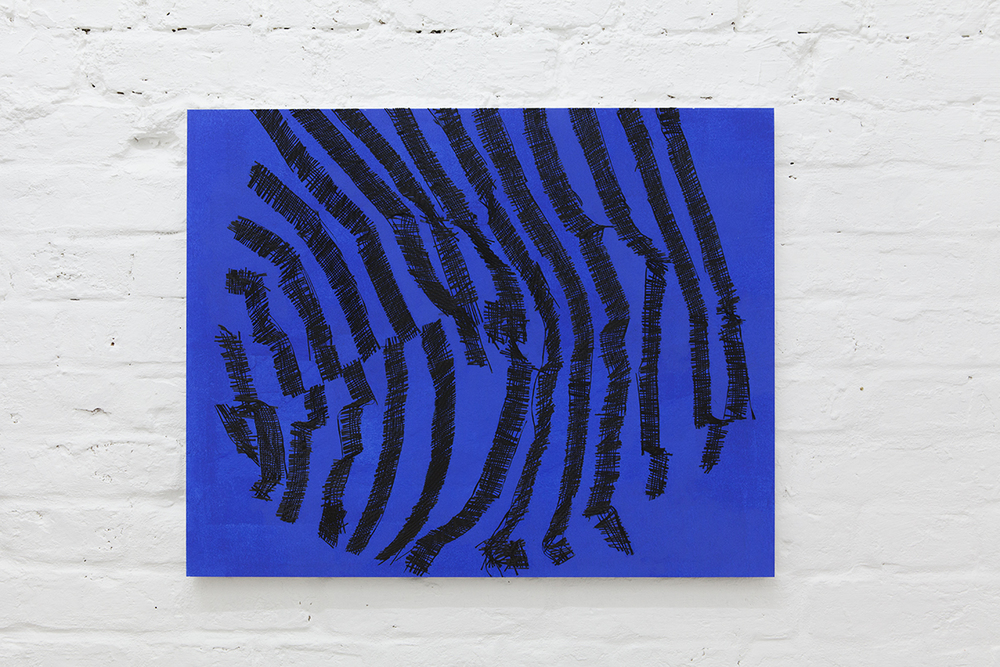
The verso of these painting objects are wildly gestural, figuratively rooted works done in watered down ink with oil paint. With fewer hardcoded allusions than the photographic canvases, but the limitless inherent to abstract gesture, these distended faces and bodies afloat on fields of color, flora, astral energies, ribbons and flares operate as portals that both welcome and overwhelm. They are mirror counterpoints to their other halves, wrought with an improvisational intimacy that showcases mark making as an act of pure fetish—mainlining the literal forms of self-exploitative fetish on display elsewhere in the exhibition.

Taken as a whole, Berman’s first show at the gallery is a forest of totems to expressive freedom. Like a fun house or freak show or pages of a novel, viewers amble through the physical maze as an analog to psychological or transcendental ones, finding a path dictated by the frictions that capture their attention and propel them through a personal journey in conversation with the artist’s. These freestanding, corporealized images whose dueling faces ricochet off one another in a chorus of overtures of retreats, into a interior world externalized, governed by play and pleasure, confusion and reclaimed clarity.
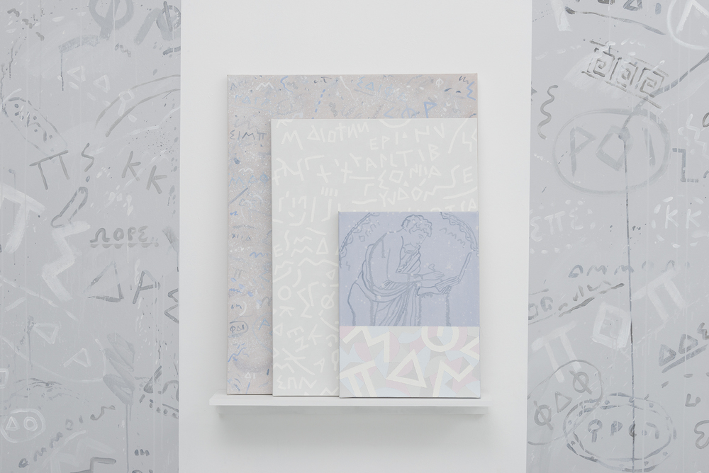
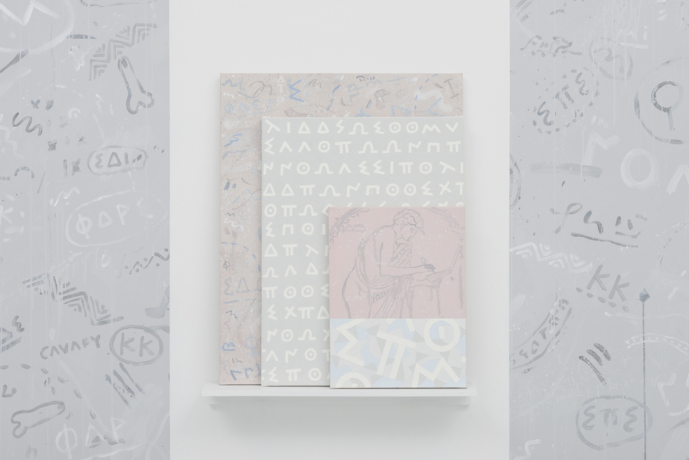
Nora Berman - Charm
Ellis King, June 9 - July 16
www.ellisking.net

JOE BRADLEY - CANTON ROSE, GALERIE EVA PRESENHUBER

Installation view, Joe Bradley, Canton Rose, Galerie Eva Presenhuber

Installation view, Joe Bradley, Canton Rose, Galerie Eva Presenhuber

Installation view, Joe Bradley, Canton Rose, Galerie Eva Presenhuber

Installation view, Joe Bradley, Canton Rose, Galerie Eva Presenhuber

Installation view, Joe Bradley, Canton Rose, Galerie Eva Presenhuber

Installation view, Joe Bradley, Canton Rose, Galerie Eva Presenhuber

Installation view, Joe Bradley, Canton Rose, Galerie Eva Presenhuber

Installation view, Joe Bradley, Canton Rose, Galerie Eva Presenhuber

Installation view, Joe Bradley, Canton Rose, Galerie Eva Presenhuber

Installation view, Joe Bradley, Canton Rose, Galerie Eva Presenhuber

Installation view, Joe Bradley, Canton Rose, Galerie Eva Presenhuber

Installation view, Joe Bradley, Canton Rose, Galerie Eva Presenhuber

In Joe Bradley’s sculptural work, there seem to exist two opposing ways that, in terms of their effect on the viewer, couldn’t be more different from each other and yet give the impression that they unite two imminent art-historical standpoints: On the one hand, there are open-form, figurative bronze sculptures on pedestals, like they were on view in his first solo exhibition at Gagosian Gallery in New York. In their form and manner, these works can be perceived as both following and continuing Bradley’s early paintings in an archaic-cartoonish style (Schmagoos). On the other hand, there are closed-form minimalist sculptures, which are to be classified as part of the tradition of his “Modular” Paintings. These cubic, man-size sculptures, some monochrome, others bicolored, are primarily characterized by their significant and emblematic presence. Similar to the black monolith in Stanley Kubrick’s “2001: A Space Odyssey” (1968), Bradley’s colored monoliths seem to repress the surrounding space and powerfully face the viewer. At the same time, the vibrant and comic-like colors impart the works a playful ingenuousness.
The comparison of both types of sculpture in Bradley’s work appears exemplary of the development of sculpture since the modern age in general. His bronze sculptures breathe the spirit of both primitive and modern art. In contrast, the here exhibited aluminum and Plexiglas sculptures formulate the constructivist alternative. The narrative titles of these woks don’t appear to have a direct connection to the works themselves and point to a sculpture’s character as an intellectual projection surface. The sculptures can be presented both in- and outdoors. Parallel to this exhibition, Joe Bradley will present a new outdoor-sculpture on the Cycladic island of Antiparos in Greece.
 
What is formally separated in Bradley’s sculptural work is unified in his painterly work. Thus, it forms an arc of suspense between sculpture and painting.  Joe Bradley’s versatile painterly oeuvre is based on a complex visual language. His groups of works vary between primitive iconology, gestural abstraction and a radical, hardedge attitude. The nine large-sized paintings of the exhibition are part of this tradition and unite elements of the previously separated groups of works. They are not painted on consistently stretched canvases, but rather consist of different canvases, which have been sewn together in a collage-like manner, with individual areas that are partly painted and worked on by the artist, partially monochrome colored, or left in their untreated primordial state. Bradley sees this new group as a continuation of the works of his last exhibition at Galerie Eva Presenhuber (2014), where he presented a series of paintings, which he describes as “modular paintings”, or “figures”, which revisits the strategies employed in the earlier works. Each painting was comprised of multiple panels, made of stretched canvases, with some of them creating figure-like shapes whilst some others embodied forms of abstract totems.

With this new body of work Bradley succeeds to enlarge his already very rich oeuvre and vocabulary and to manifest a distinct sculptural character in his paintings.

Joe Bradley - Canton Rose
Galerie Eva Presenhuber, June 12 - July 23
www.presenhuber.com

Katherine Bernhardt - Product Recall: New Pattern Paintings, Xavier Hufkens

Installation view, Katherine Bernhardt, Product Recall: New Pattern Paintings, Xavier Hufkens

Installation view, Katherine Bernhardt, Product Recall: New Pattern Paintings, Xavier Hufkens

Installation view, Katherine Bernhardt, Product Recall: New Pattern Paintings, Xavier Hufkens

Installation view, Katherine Bernhardt, Product Recall: New Pattern Paintings, Xavier Hufkens

Installation view, Katherine Bernhardt, Product Recall: New Pattern Paintings, Xavier Hufkens

Installation view, Katherine Bernhardt, Product Recall: New Pattern Paintings, Xavier Hufkens

Installation view, Katherine Bernhardt, Product Recall: New Pattern Paintings, Xavier Hufkens

Installation view, Katherine Bernhardt, Product Recall: New Pattern Paintings, Xavier Hufkens

Installation view, Katherine Bernhardt, Product Recall: New Pattern Paintings, Xavier Hufkens

Installation view, Katherine Bernhardt, Product Recall: New Pattern Paintings, Xavier Hufkens

Installation view, Katherine Bernhardt, Product Recall: New Pattern Paintings, Xavier Hufkens

Installation view, Katherine Bernhardt, Product Recall: New Pattern Paintings, Xavier Hufkens

Installation view, Katherine Bernhardt, Product Recall: New Pattern Paintings, Xavier Hufkens

Installation view, Katherine Bernhardt, Product Recall: New Pattern Paintings, Xavier Hufkens

Known for her large-scale pattern paintings depicting constellations of everyday items that have been isolated from their original context, American artist Katherine Bernhardt has created a new ensemble of colourful and dynamic images that take inspiration from both Brussels and New York. Executed in acrylic and spray paint on canvas, in a spontaneous and fluid style, her latest work features objects typically associated with Belgian popular culture, such as Smurfs and chocolate, with those representative of America, such as Lisa Simpson and Nike trainers. Added to the mix are domestic objects like toilet rolls and Windex (an American cleaning product); toucans and tropical fruits (a reference to the artist’s frequent travels to Puerto Rico); iconic games from her teenage years during the early 1980s (Pac-Man and the Rubik’s cube); and food and drink (Nutella, cigarettes, wine). Because of the myriad objects in her work, it is sometimes interpreted as a wry comment on consumerism. Yet this is not a conscious concern of the artist, who is primarily motivated by a fascination with her everyday surroundings, and in giving it expression through colour and composition. 

When scrutinised carefully, Bernhardt’s work offers up intriguing sets of tonal, temporal and formal correspondences: the yellow Pac-Men are the same colour as Lisa Simpson; the Smurfs and the Windex are an identical shade of blue; the facets of the Rubik’s cube mirror the squares of chocolate; rectilinear black and white forms (cigarettes) are the antithesis, both literal and figurative, to the glowing, luscious fruits (papayas and kiwis); nature (toucans) counteracts the artificiality of consumer culture (Nike trainers); the cartoon characters belong to both the past and the present, to the old and the young. The clusters of objects in Bernhardt’s work are deceptively simple but possessed of an associative power that is both intensely autobiographical yet improbably universal. By introducing objects from a bygone era into her paintings, however, they not only allude to popular culture but also to memory.

The origins of Bernhardt’s graphic, pattern-based approach can be traced back to her early encounters with street graffiti and a distinctive type of African fabric that is made using a technique called ‘Dutch wax printing’ (and which, coincidentally, often contains unexpected combinations of objects). This material is widely available in Bernhardt’s neighbourhood in Brooklyn and has been used as the foundation to her largest fabric collage to date, which is being exhibited for the first time. In this resonant and highly charged work, the artist juxtaposes her light-hearted nostalgia for the games of her youth, one of the dominant themes of her paintings, with potent symbols of contemporary geopolitics (images of President Obama, the hand of Fatima, mosques, talismans to ward off the curse of the Evil Eye). The piece also reflects Bernhardt’s interest in the history of textiles and the American tradition of quilt making, more specifically the quilts that have been produced in the African-American hamlet of Gees Bend, Alabama, since the early nineteenth century, and to which her work shares a formal and emotional affinity. In the centre of the piece is an hourglass, which ties everything together, and links the various trans-historical and political aspects to a specific point in time, the here and the now.

Katherine Bernhardt - Product Recall: New Pattern Paintings
Xavier Hufkens, May 17 - June 18
www.xavierhufkens.com
 

ZIGGY GRUDZINSKAS - COGNITIVE DISSONANCE, TRISTIAN KOENIG

Installation view, Ziggy Grudzinskas, Cognitive Dissonance, Tristian Koenig

Installation view, Ziggy Grudzinskas, Cognitive Dissonance, Tristian Koenig

Installation view, Ziggy Grudzinskas, Cognitive Dissonance, Tristian Koenig

Installation view, Ziggy Grudzinskas, Cognitive Dissonance, Tristian Koenig

Installation view, Ziggy Grudzinskas, Cognitive Dissonance, Tristian Koenig

Installation view, Ziggy Grudzinskas, Cognitive Dissonance, Tristian Koenig

Installation view, Ziggy Grudzinskas, Cognitive Dissonance, Tristian Koenig

Installation view, Ziggy Grudzinskas, Cognitive Dissonance, Tristian Koenig

Installation view, Ziggy Grudzinskas, Cognitive Dissonance, Tristian Koenig

Installation view, Ziggy Grudzinskas, Cognitive Dissonance, Tristian Koenig

Installation view, Ziggy Grudzinskas, Cognitive Dissonance, Tristian Koenig

Installation view, Ziggy Grudzinskas, Cognitive Dissonance, Tristian Koenig

Grudzinskas possess and deploys a wide range of painterly techniques, with his work displaying a quiet tension between positive and negative gestures - between movements loaded with media spread across the painting's surface, and differing processes of erasure and removal. Playing off diametrically opposed values is further continued in contrasting flatness and depth, and diffuse sprays with crisp lines, which is heightened through a limited, almost monochromic, palette. Through these various procedures of application and cancellation, Grudzinskas’ liminal traces mirror the aesthetic and experience of contemporary urbanity. 

Like a graffiti-filled city wall that has been sprayed, buffed, tagged and plastered with posters and all manner of paraphernalia ad infinitum, Grudzinskas’ paintings are almost geological in their accretion of conflicting and contradictory traces of the artist’s presence, through mediated gestures that initially appear somewhat removed from ‘painting’ and the ‘hand of the artist’. Creation, destruction, entropy and a harmonious disequilibrium are defining characteristics of Grudzinskas’ paintings. His paintings are defined as much by what they are not, and what they hold back, as much as what they are - what they reveal and hide from the viewer.

Ziggy Grudzinskas - Cognitive Dissonance
Tristian Koenig, June 2 - July 2
www.tristiankoenig.com

Shahryar Nashat - Model Malady, Portikus

Installation view, Shahryar Nashat, Model Malady, Portikus

Installation view, Shahryar Nashat, Model Malady, Portikus

Installation view, Shahryar Nashat, Model Malady, Portikus

Installation view, Shahryar Nashat, Model Malady, Portikus

Installation view, Shahryar Nashat, Model Malady, Portikus

Installation view, Shahryar Nashat, Model Malady, Portikus

Installation view, Shahryar Nashat, Model Malady, Portikus

Installation view, Shahryar Nashat, Model Malady, Portikus

Installation view, Shahryar Nashat, Model Malady, Portikus

Installation view, Shahryar Nashat, Model Malady, Portikus

Installation view, Shahryar Nashat, Model Malady, Portikus

Installation view, Shahryar Nashat, Model Malady, Portikus

Portikus is pleased to present Model Malady, an exhibition by Swiss artist Shahryar Nashat (*1975, lives and works in Berlin). Within his artistic practice, the artist uses means and ways to steer or interrupt the contemplative gaze, thereby directing the focus on the unheeded, the unsolicited. To achieve this, the artist resorts to various media such as video, photography and sculpture.

The core of his upcoming exhibition Model Malady at Portikus is composed of two new works: Present Sore(2016) and Chômage Technique (2016).

Present Sore is a video work, a composite portrait of the 21st-century body mediated by substances both organic and fabricated. Commissioned by Portikus and the Walker Art Center, Minneapolis, it is temporarily streamed on the Walker Online Channel, and will now be presented as an installation in Frankfurt. In Present Sore, we see the human body not as a whole, but only in detail—like a close-up of the knee or the hand. The focus is on fragments, showing the mechanical moving “parts” of the body and isolating their function as tools.

Chômage Technique is a new group of sculptures that Nashat created for Portikus and the forthcoming Walker exhibition. Consisting of plinths resting on lounging display structures that the artist says are designed for them to “relax”, those obsolete pedestals have no artwork or body to support anymore. They become like laid-off workers, with complimentary front row seating for Present Sore, so that they can enjoy watching the video and its digital depiction of the bodies they would once have supported.

Shahryar Nashat - Model Malady
Portikus, April 23 - June 19
www.portikus.de

BEAU LAUSS - LAST RESORT

Installation view, Beau Lauss, Last Resort

Installation view, Beau Lauss, Last Resort

Installation view, Beau Lauss, Last Resort

Installation view, Beau Lauss, Last Resort

Installation view, Beau Lauss, Last Resort

Installation view, Beau Lauss, Last Resort

Installation view, Beau Lauss, Last Resort

Installation view, Beau Lauss, Last Resort

Installation view, Beau Lauss, Last Resort

Installation view, Beau Lauss, Last Resort

Installation view, Beau Lauss, Last Resort

Installation view, Beau Lauss, Last Resort

"Pour nos informatrices de Garges-lès-Gonesse qui sont originaires du Mali, le mot bolos (qu'elles prononcent d'ailleurs [boRos]) serait une déformation du mot boore qui signifie le "pigeon" en soninké. Pourtant, Gérard Galtier, professeur de soninké, croit peu à cette piste étymologique car il nous a affirmé que tous les mots soninkés se finissaient par une voyelle. Il resterait alors la possibilité de l'ajout d'une suffixation -os, à la française, mais ce type de suffixation était surtout à la mode dans les années 1980 et reste donc peu probable pour un mot que les plus audacieux proclament connaître depuis 10-12 ans en 2008 et dont les premières attestations retrouvées dans les chansons rap (et uniquement chez les membres de Mafia K'1 fry de Val-de-Marne) datent de 2003. Si l'on écarte d'autres pistes assez improbables concernant les emprunts (nos enquêtés ont mentionné plusieurs fois qu'en portugais, lesbolos étaient des "gâteaux" et ont tenté d'envisager une origine roumaine, tzigane et même corse), la piste la plus sérieuse reste celle

de bolo (pl. bolos), qui désigne les "testicules" dans l'argot espagnol et qui signifie "fou" dans l'argot de Tolède. Dans l'argot cubain, los bolos est également un surnom donné aux Russes".

Alena Podhorna-Policka (Université Masaryk de Brno)
Anne-Caroline Fiévet (Université Paris Descartes)
"A la recherche de la circulation d'un néologisme identitaire : le cas de bolos"

Beau Lauss gathers artists Adam Cruces, Antoine Donzeaud, Matthieu Haberard and Zoé de Soumagnat around some kind of flowchart of the living. Adam Cruces’ fruits and vegetables in levitation on a white background, Antoine Donzeaud’s blown up, annotated, and damaged posters, Matthieu Haberard’s geographic anachronism mask or matrix sculpture, Zoé de Soumagnat’s vintage ad-like paintings, all define their own protocole of appearance as well as they vouch for the permeability, the versatility, and the elasticity of their language. Urban, classic, merchandising, custom or high-tech, the spheres, networks and references allow to be drawn out of their comfort zone and accept the new genealogy of the exhibition. The sign, in the background, like a vanishing graffiti, becomes the alphabet of a new syntax, a model tongue that shifts, twists and recovers, evading its own etymology.

Text by Elisa Rigoulet
Photos by Carl Holck
Exhibiting artists: Adam Cruces, Antoine Donzeaud, Matthieu Haberard and Zoe de Soumagnat.

Beau Lauss
Last Resort, May 12 - June 4
www.lastresortgallery.com


JOAKIM MARTINUSSEN - TOP STORY STORY STORY, VIN VIN

Installation view, Top Story Story Story, Vin Vin

Installation view, Top Story Story Story, Vin Vin

Installation view, Top Story Story Story, Vin Vin

Installation view, Top Story Story Story, Vin Vin

Installation view, Top Story Story Story, Vin Vin

Installation view, Top Story Story Story, Vin Vin

Joakim Martinussen, Untitled (Blue Tablecloth, Pizza, Espresso in Red Bull), 2016

Joakim Martinussen, Untitled (Blue Tablecloth, Pizza, Espresso in Red Bull), 2016

Joakim Martinussen, Untitled (Bogus Injury, Climber’s Jersey, Salmon), 2016

Joakim Martinussen, Untitled (Bogus Injury, Climber’s Jersey, Salmon), 2016

Joakim Martinussen, Untitled (Blue), 2016

Joakim Martinussen, Untitled (Blue), 2016

You can have coffee beans delivered home every Monday, like Evergood or Friele or Meinl Kaffee. You can set up a subscription online for other things you need. Detergents and wet wipes. Keep your baby’s butt clean. What’s more contemporary than a newborn? Be in the moment. Be on the telephone. Get up early and do nothing. Or get enough sleep. Keep that sandcastle body up. Use conditioner. Eat breakfast. You could add cereals to that subscription, and have cornflakes delivered with DHL or UPS or USPS or Österreichische Post. Spring time again. Back pain. Mom’s birthday. Keep up with new technology and new times, and your neighbor’s gardening. Buy a new calendar. Pay bills. Make lunch. Arrange alternate slices of tomato and mozzarella cheese on a serving platter. Have another coffee. Vacuum clean. Wipe the new dust off your things. Homemaking never gets old. Be quick. Get out in nature on your bicycle. Have it decorated with decal stickers that say «Christian-Bale-American-Psycho-Workout», or «Laaanc Armstorng», or «Financial Times Northern European Skin Colour». Wait for another FedEx or Posten.no package. Maybe a new pair of black socks. Drink a red bull before bed and vibrate.

Joakim Martinussen - Top Story Story Story
Vin Vin, May 12 - June 24
www.vinvin.eu

SOME ASTRONOMERS KEPT A DISTANCE - SALÓN

Installation view, Andrea Zucchini, Born in a pot, Salón

Installation view, Andrea Zucchini, Born in a pot, Salón

Installation view, Andrea Zucchini, Born in a pot, Salón

Installation view, Andrea Zucchini, Born in a pot, Salón

Installation view, David Ferrando Giraut, Some astronomers kept a distance, Salón

Installation view, David Ferrando Giraut, Some astronomers kept a distance, Salón

Installation view, David Ferrando Giraut, Some astronomers kept a distance, Salón

Installation view, David Ferrando Giraut, Some astronomers kept a distance, Salón

Some astronomers kept a distance is a self-contained intervention by artists Andrea Zucchini and David Ferrando Giraut. In the context of SALÓN, the installation unfolds as a total environment examining the tautologies of potential universes, whether real or fictitious, and the impact they might have on human behaviour.

Paying attention to the 1584 ground-breaking work ‘’On the Infinite Number of Possible Worlds’’, by Italian Dominican friar, philosopher, mathematician, poet and astrologer Giordano Bruno, and its connection to Bruno’s parallel exploration on non-objective concepts such as magic, the project takes the viewer on an erratic spatial tour through the limits of physics and rationality. In an environment where inanimate items and animate representations exist on the same level with neither of these categorically different species taking the upper hand, the project is a exploratory journey into our human share in the world which is made visible by confronting us with the most primary limits of the human comprehension.

SALÓN is an artist run space based in Madrid. It serves as an exhibition platform for curators and artists with special emphasis on encouraging them to realize experimental projects while operating as a meeting point for international and local practitioners. 

Curated by Alejandro Alonso Díaz

Andrea Zucchini and David Ferrando Giraut - Some astronomers kept a distance
Salón, May 26 - June 5

RENATO LEOTTA - AVENTURA, GALERIA MADRAGOA

Installation view, Renato Leotta, Aventura, Galeria Madragoa

Installation view, Renato Leotta, Aventura, Galeria Madragoa

Installation view, Renato Leotta, Aventura, Galeria Madragoa

Installation view, Renato Leotta, Aventura, Galeria Madragoa

Renato Leotta, Mais ou Menos, 2016

Renato Leotta, Mais ou Menos, 2016

Renato Leotta, Aventura (Madeira), 2016

Renato Leotta, Aventura (Madeira), 2016

Renato Leotta, Un Fatto Completo (madragoa), 2016

Renato Leotta, Un Fatto Completo (madragoa), 2016

Aventura.

On the beaches of the Atlantic coast north of Lisbon, we wondered taking care not to step on the drawings that the ocean had created on the sand, once it retired in the low tide.
As soon as the huge water masses diminished, according to the laws of cosmic attraction, they left before our eyes samples of curves, lines and ridges. An alphabet of sand images that every day tells a different version of the same story.

The time allowed to the observation of this phenomenon is governed by the stars and in particular by the Moon and the Sun; soon the ocean would have moved, gradually erasing what it had drawn, just to reformulate afterwards a new script.

It led to the intuition that the history of the Time coincides with the history of the Space, which in that moment was going to slowly shrink, forcing the western border to get a few tens of meters closer to Athens; and it forced us to quickly fall back to the rocks, as if in a game shaped after the movement of the accordion, drawing a constantly oscillating border which could mark the beginning or the end of a story (or a continent).

We recovered some of these images by making casts of the surface of the beach and from them we obtained the positive using clay boards in order to preserve them and observe their shapes later in time with more attention.

Although the cosmic force that determines the movement of the tides acts impartially on all parts of the globe, the nature of the tide at any particular place is a local and specific matter; their manifestation can be very different even if they occur within a short geographic distance, depending on the topographical features of this or that other bay.

This phenomenon escapes the possibility of being caught through a dethatched impartiality, describing an everchanging horizon that can not be determined recurring to general formula; just like the city and the people who inhabit this or that place, the sea takes the shape of the space it occupies.

The trace of salt that emerged on the fabrics after the water was evaporated in the sun indicates the discriminate between the immersed part and the portion which remained on the surface. All these experiences were gathered as a collection of broken down horizons.

If we consider the ocean as a complex organic system, capable of describing our planet, and we compare the mass of water existing on the surface to the organs of the human body, the Mediterranean Sea might look like the stomach, able to digest and translate the natural elements into a viscerally told story of man and his deepest intimacy.

Thousands nautical miles away on the same meridian, in the Egadi islands, I tried to record the image that could better describe this adventure, a suspension in which we place ourselves as human beings and where the entire course of history takes place.

I imagined the sea as a large dark room and the moon as an enlarger whose phases determine the diaphragm apertures. On the surface of the paper, the light was registered, modulated by the Scirocco breezes and the motion of the waves and small whirlpools.

Text by Renato Leotta.

Renato Leotta - Aventura
Galeria Madragoa, April 28 - June 11
www.galeriamadragoa.pt

KOUR POUR - ONNAGATA, FEUER/MESLER

Installation view, Kour Pour, Onnagata, Feuer/Mesler

Installation view, Kour Pour, Onnagata, Feuer/Mesler

Installation view, Kour Pour, Onnagata, Feuer/Mesler

Installation view, Kour Pour, Onnagata, Feuer/Mesler

Installation view, Kour Pour, Onnagata, Feuer/Mesler

Installation view, Kour Pour, Onnagata, Feuer/Mesler

Installation view, Kour Pour, Onnagata, Feuer/Mesler

Installation view, Kour Pour, Onnagata, Feuer/Mesler

Installation view, Kour Pour, Onnagata, Feuer/Mesler

Installation view, Kour Pour, Onnagata, Feuer/Mesler

Installation view, Kour Pour, Onnagata, Feuer/Mesler

Installation view, Kour Pour, Onnagata, Feuer/Mesler

Kour Pour’s newest body of work addresses Japonisme – the fascination by Western artists with Japanese art and aesthetics. For these five paintings, Pour has adapted the traditional technique of Ukiyo-e prints. Originally used to make easily reproducible art for the masses, many elements such as pictorial cropping, clean contours and compositional characteristics have become incorporated into Western art since the Impressionists. The seemingly abstract forms in these new paintings have been taken from images of earthquake and volcano maps produced by the Japanese Geological Survey and share a resemblance with abstract painting embedded in an American or European tradition. The printing blocks used in Pour’s ukiyo-e process are on view alongside their resulting works and display all the markings and stains of everyday work.

Also in this exhibition is a body of work influenced by ornamental Japanese paper making processes. Washi, Origami and Tsugigami involve the careful tearing, folding, collaging and layering of handmade papers to create aesthetically and physically delicate forms. Pour’s paper pieces are made from newspaper pulp and dyed with ink. Shredding and tearing the newspapers apart, Pour then physically throws the pulp against linen panels. The resulting pieces combine those traditional, delicate Japanese styles of paper making with gestural and spontaneous actions ending in a heavy, impasto-like surface.

In both, Pour continues his past explorations of visual aesthetics produced through cultural exchange. As the visual imagery resulting from volcanic and tectonic movements and the exhibition’s title, Onnagata, suggest, the paintings question notions of originality and shifting relationships between appearance and identity. 

Pour Pour - Onnagata
Feuer/Mesler, May 11 - June 19
www.feuermesler.com

CORY ARCANGEL - CURRENTMOOD, LISSON GALLERY

Installation view, Cory Arcangel, currentmood, Lisson Gallery

Installation view, Cory Arcangel, currentmood, Lisson Gallery

Installation view, Cory Arcangel, currentmood, Lisson Gallery

Installation view, Cory Arcangel, currentmood, Lisson Gallery

Installation view, Cory Arcangel, currentmood, Lisson Gallery

Installation view, Cory Arcangel, currentmood, Lisson Gallery

Installation view, Cory Arcangel, currentmood, Lisson Gallery

Installation view, Cory Arcangel, currentmood, Lisson Gallery

Installation view, Cory Arcangel, currentmood, Lisson Gallery

Installation view, Cory Arcangel, currentmood, Lisson Gallery

Installation view, Cory Arcangel, currentmood, Lisson Gallery

Installation view, Cory Arcangel, currentmood, Lisson Gallery

Installation view, Cory Arcangel, currentmood, Lisson Gallery

Installation view, Cory Arcangel, currentmood, Lisson Gallery

Installation view, Cory Arcangel, currentmood, Lisson Gallery

Installation view, Cory Arcangel, currentmood, Lisson Gallery

Installation view, Cory Arcangel, currentmood, Lisson Gallery

Installation view, Cory Arcangel, currentmood, Lisson Gallery

A technological exploration of obsession and obsolescence underlies all the works in ‘currentmood’, Cory Arcangel’s second solo show at Lisson Gallery London. Reflecting the temporal nature of web-based culture and the American artist’s own transient interests, the new works in this exhibition present something like a ‘listicle’ image dump self-portrait of Arcangel (who often shares his browsing habits on social media via the hashtag #currentmood).

The exhibition takes place at Lisson Gallery London and extends online through an advertising campaign. IRL (Internet slang for “In Real Life”), at 27 Bell Street, new works are presented, created via a variety of media and drawn from a variety of sources, including scans of Ibiza flyers, tracksuits and magazines; default Photoshop image effects; commercial and cell phone photography; low-res screen captures, as well as emulations and re-prints of earlier works by the artist.  Encountered within the forum of the exhibition, these are each given equal billing and size despite their varying subject matters and the relative renown of their production methods within the artist’s oeuvre.

Online, the artist will run a series of ads for the show which will appear dispersed across the Internet as ‘promoted content’. In this context, ‘currentmood’ takes the equanimity of Internet culture as its template, embracing the radical disjunctions, open sensibility and non-hierarchical stance in its advances. Arcangel is concerned with the democratization of his own art: by exhibiting the same image both IRL in a white cube and online as ‘click bait’; in the leveling of cultural value, despite variance of image quality; and in his adherence to open source culture (evidenced especially in work titles that double as instructions to make them oneself).

Arcangel’s innumerable ideas and projects spin from the duality of technological evolution: its dazzling opportunities and fast oblivion to the scrap heap. In hijacking popular software or web technology – such as the Java applet ‘lake’ that was much used at the end of the last millennium – Arcangel is attentive to collective memories, celebrating their outmoded aesthetics while interrogating their cultural moment. Kitsch, tacky or banal graphics and images are wryly incorporated into a dialogue that incorporates art history, literature and music. “I’m not taking sides with almost anything,” Arcangel has said. “For me, to see how these things change is my interest." ¯\_(ツ)_/¯

Cory Arcangel - currentmood
Lisbon Gallery, May 20 - July 2
www.lissongallery.com

HAYAL POZANTI - CORPUS, LEVY DELVAL

Hayal Pozanti’s first solo exhibition in Brussels continues to be inspired by her longterm interest in cyborg anthropology, a framework for understanding the effects of technology on humans and culture. Titled Corpus, the show is based on research related to the merging of human bodies with machines via implanted electronic devices. Through the works in this exhibition, Pozanti encourages the viewer to consider the relevance of physical bodies in a posthuman future where we have reached technological singularity, a hypothetical event in which artificial intelligence would be capable of recursive selfimprovement. In such a future, what would be the role of embodied cognition and embodied emotion? Could a brain in a box ever be the same as a mind in a body? If not, how do we imagine the limits of our symbiosis with machines? By positing the body as a focal point of the exhibition, Pozanti not only contemplates these questions but also encourages us to consider the commonalities of our species. In an increasingly hostile and divided global climate, she seizes an opportune moment to ask ‘What is it that makes us human?”

Visually, Pozanti's work relies on an invented alphabet of 31 shapes, which she has named 'Instant Paradise'. This lexicon is source material for all her paintings, sculptures, animations and sound pieces. Each shape in Instant Paradise has been assigned a number and a letter from the English alphabet, allowing her to literally 'translate' data through a personalized encryption system. She has created a typeface from her
characters, as well as phonemes that she resources for her animations and her sound pieces, respectively. Pozanti's hermetic visual language aims to intercept and clog visual feeds. By creating compositions through a wholly invented shape generating system, she refuses to mirror the feed and thus decelerates information flows. Her decision to employ a mind to hand method for creating her shapes, as well as her insistence on painting, stems from a desire to bring her body back into the creative process. In doing so, she disengages a part of her creative process from the premeditated constructs of digital programs and machines.

Corpus is installed in the main gallery of Levy Delval and features three paintings, two wall murals, two CSS animations and a sound piece. The paintings and wall murals are based on current numbers of cyborgs within the human population while the animations are based on a chat session Pozanti had with Cleverbot, a web application that uses an artificial intelligence algorithm to have conversations with humans. The sound
piece is a recording of her reading this same conversation in Instant Paradise, interlaced with emotive sighs and other non verbal vocal communication cues.

Hayal Pozanti - Corpus
Levy Delval, April 19 - May 28
www.levydelval.com

Contribution by Domenico de Chirico. 

Mandy El-Sayegh - this is a sign, CARLOS/ISHIKAWA

Installation view, Mandy El-Sayegh, this is a sign, Carlos/Ishikawa

Installation view, Mandy El-Sayegh, this is a sign, Carlos/Ishikawa

Installation view, Mandy El-Sayegh, this is a sign, Carlos/Ishikawa

Installation view, Mandy El-Sayegh, this is a sign, Carlos/Ishikawa

Installation view, Mandy El-Sayegh, this is a sign, Carlos/Ishikawa

Installation view, Mandy El-Sayegh, this is a sign, Carlos/Ishikawa

Installation view, Mandy El-Sayegh, this is a sign, Carlos/Ishikawa

Installation view, Mandy El-Sayegh, this is a sign, Carlos/Ishikawa

Installation view, Mandy El-Sayegh, this is a sign, Carlos/Ishikawa

Installation view, Mandy El-Sayegh, this is a sign, Carlos/Ishikawa

Installation view, Mandy El-Sayegh, this is a sign, Carlos/Ishikawa

Installation view, Mandy El-Sayegh, this is a sign, Carlos/Ishikawa

Installation view, Mandy El-Sayegh, this is a sign, Carlos/Ishikawa

Installation view, Mandy El-Sayegh, this is a sign, Carlos/Ishikawa

Installation view, Mandy El-Sayegh, this is a sign, Carlos/Ishikawa

Installation view, Mandy El-Sayegh, this is a sign, Carlos/Ishikawa

Mandy El-Sayegh - this is a sign
Carlos/Ishikawa, May 20 - June 25
www.carlosishikawa.com

Hubert Marot - Nul bruit à l’horizon, nul cri dans les nuages, Galerie Untilthen

Perhaps everything is an image – objects, people, even thoughts. When it calls for it, we gather what is most intimate to us, often at arm’s length. Why look too far? Back in 1957, the rst digital image made by Russell Kirsch was of his three-month-old son, Walden. This headshot measured just 5cm by 5cm, 176 pixels on one side, and was created by feeding the image through a rotating drum scanner programmed by the Standards Eastern Automatic Computer (SEAC). As all baby pictures, before and after, it has an openness that knows no bound, but also a hesitancy that sends a glare past the materiality of the image, the occasion, resolutely puncturing the present, and passing the future.

Such malleable temporality pervades Hubert Marot’s practice that ricochets from painting to ceramic to sculpture, all through photography’s materiality and potential to recalibrate time. Painted plastic sheeting and a fan generate an instability of the negative and its receptive image, on stretched canvases that have been applied with photo-sensitive emulsion. It seems as if the wind is still blowing the blur around the slow surfaces of the resulting images. Ben- dy metal forms, vaguely recalling car headlights, echo the imprecise cuts of folded clay tablets, thus functioning as both tool and material.

Found used batteries, their expiration dates certainly uncertain, bide and bind time. Images fade. Batteries go out. But before that, they fuel the apertures of the ceramic with LED, like an open ame. Just as a photo, they need light. We need light. Is it an apparatus? A personal evocative device? An autonomous and anonymous vehicle? Marot has been working as a covert parallel practice a series of iPhone photos turned resinotype, a pigment photographic process from early 20th century. With it, the speed of fast capture is countered by the slowness of printing. In his work, the speed of recognition is always countered by the slowness of our understanding.

Walden Kirsch grew up to become a television reporter and worked for Intel, though nowadays anything is in ected and infected by the digital, this trajec- tory bears no signi cance. Perhaps, what matters now is not a capture of the new image, but how to extract and elongate time, like the curve of an open upraised arm, as protection and exaltation, susceptible to dreaming. Not as an immediate release, but a protracted one, of energy transmission.

Text by Jo-ey Tang.

Hubert Marot - Nul bruit à l’horizon, nul cri dans les nuages
Galerie Untilthen (now&then), May 22 - June 5
www.untilthen.fr

Chris Hood, Zach Reini - Brand New Gallery

Installation view, Chris Hood, Zach Reini, Brand New Gallery

Installation view, Chris Hood, Zach Reini, Brand New Gallery

Installation view, Chris Hood, Zach Reini, Brand New Gallery

Installation view, Chris Hood, Zach Reini, Brand New Gallery

Installation view, Chris Hood, Zach Reini, Brand New Gallery

Installation view, Chris Hood, Zach Reini, Brand New Gallery

Installation view, Chris Hood, Zach Reini, Brand New Gallery

Installation view, Chris Hood, Zach Reini, Brand New Gallery

Installation view, Chris Hood, Zach Reini, Brand New Gallery

Installation view, Chris Hood, Zach Reini, Brand New Gallery

Zach Reini, You're Right, She's Gone, 2015

Zach Reini, You're Right, She's Gone, 2015

Zach Reini, Daisy, Daisy Give Me Your Answer, 2015

Zach Reini, Daisy, Daisy Give Me Your Answer, 2015

Installation view, Chris Hood, Zach Reini, Brand New Gallery

Installation view, Chris Hood, Zach Reini, Brand New Gallery

Chris Hood
“I see my work as a kind of passage, or crossing. In a literal sense, the imagery and paint emerge from the reverse but also in a conceptual sense this is a space where the viewer reconciles themselves with an ever increasingly simulated experience. In contrast to collage where distinct juxtapositions disrupt the visual field, my work seeks to describe an experience where all things fuse and sit in a liminal, in-between kind of space - collapsing the internal and external. Subsumed, stained, bound by the surface of the painting. I often use vernacular sources and humor to point to the tension in this uneasy experience while also activating a third kind of response in the sometimes surreal, or psychedelic, painterly joining of imagery and color. These are paintings for sure, where color, form, and surface play out perceptually for the viewer, but also amalgamations of the act of shifting through a progressively unreal experience.” Chris Hood’s artworks reflect an understanding of the abstract nature in which personal and social imagery collide in the twenty first century. Combining traditional techniques with the languages of digital territories, his work often features images culled from american counter-culture, art history, and mass media rendered abstract by translation.

Zach Reini
Zach Reini uses iconic American imagery and a minimal insertion of the artist’s hand to bastardize and recode the viewer’s relation to cultural symbology. In relation to Hito Steyerl’s essay In Defense of a Poor Image, which is primarily focused on the reproduction of a digital still, Reini implores Steyerl’s alternate definition of a “poor image [as] as an illicit fifth-generation bastard of an original image … it often defies patriarchy, national culture, and indeed copyright.” The precise cuts and viewing limitations Reini imposes on these icons recodes their symbolism from one of American innocence to a sinister and lewd caricature of American cultural identity. Using a minimal approach to restrict the visual narrative of these icons reinterprets their importance in the American codified vernacular as new arbiters of a darker purpose, thusly introducing a form of Bakhtin’s body grotesque to those who are loyal to these beloved figures; Or, rather, the small windows into the underlying painting uncover the once grotesque pretense to reveal the inherent representation, or poor image, below. Reini accomplishes a definitive blow to the ivory tower of American innocence forcing those once idealized symbols to be viewed as lewd, secretive subjects, as illicit backroom dealers of easily digestible happiness, as shadow-world puppet masters. Though the actions of these figures are physically concealed, their newly conscripted purpose resonates through Reini’s manipulated scenes in his manifested world of innocence-as-transgressor. (Chelsea Thomas)

Curated by Domenico de Chirico.

Chris Hood, Zach Reini
Brand New Gallery, May 18 - June 22
www.brandnew-gallery.com